Welcome to Part 3 of the HDR Series – Getting Started! This time you are going to learn about the settings in a HDR Tone-Mapping software I use called Photomatix Pro 4. Before you get to the adjustments window you will be prompted with this window first.
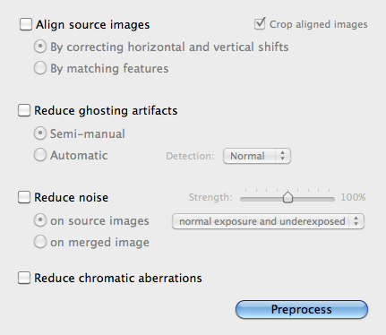
Align Source Images: I always keep this box unchecked unless I was using brackets shot by hand (which I never do). If you did shoot your brackets by hand you will want to make sure that “By correcting horizontal and vertical shifts” is selected and that the “Crop aligned images” are Unchecked. (This will save you aggravation later if you have to use layer masking in Photoshop)
Reduce Ghosting Artifacts: I usually leave this box unchecked, but if you have moving elements in your shot why not reduce the ghosting effect before tone-mapping! Photomatix Pro 4 does a great job of removing ghosting and I would suggest using “Semi-manual” and detection “Normal”, so you have the control over the areas and brackets used for ghosting control.
Reduce Noise: I teeter with this on and off. If left on I use “On Source Images” for “Normal exposure and underexposed”, Strength at 100%. Because I shoot up to 9 brackets at 1EV I find little noise in my images unless I’m dealing with sky, but even still you could remove noise in Photoshop using layers. So most of the time I am leaving this box unchecked.
Reduce Chromatic Aberrations: I leave this box unchecked as well. It does do a nice job of reducing those galactic red and green edges from light to dark transitions in your shot. But like always I remove this in post production by applying it selectively.
As you can see all of the boxes are usually left unchecked. Now let’s look at the Tone-mapping adjustments within Photomatix Pro 4.
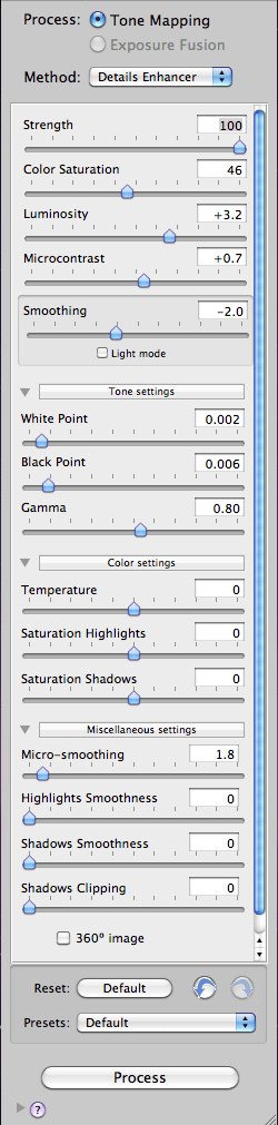
There are only 8 sliders that I adjust within the adjustments panel of Photomatix Pro, the rest I leave at default. Here they are in the order I use them.
Strength: This slider is used to determine how much tone-mapping or contrast is applied to the image. I tend to work from 70-100%, usually I will push it to 100% unless it’s a land or cityscape. Then I will use about 70-80% strength.
White Point: Photomatix WP default is too high and most of the time you will see clipping in your Histogram for the white point. I suggest you pull this slider back to get a more realistic white point that isn’t clipping. Once you find a good point move onto the black point.
Black Point: You’ll likely raise this just a little to add some depth but again you don’t want to clip the shadows on your histogram.
Luminosity: This is a slider I keep on the positive side and use anywhere from 3.0-5.0 depending on the image. This will start to bring more brightness and detail into your upper mid-tones.
Gamma: This slider defaults at 1.00. I tend to move it to the right to lighten up the shadows and mid-tones some more. If Photomatix is the only stage your images will go through besides adjustment in Aperture 3 or Lightroom you’ll want to keep this slider between 1.00 and .80. I will usually apply additional effects to my tone-mapped images using brushes and layers in Photoshop so I will adjust my tone-mapped images to be a bit more washed out looking. This allows me to play more with contrast and depth using filters later. Because of this my gamma adjustments are usually between .85 and .70.
Smoothing: This is an interesting slider. Don’t check the box that says “Light Mode” because with the slider you have more precise control. This slider should never be too far left otherwise you will end up with an acid trip of an HDR image complete with halos! Too far right might make your image too smooth. I tend to work at about -2.0 to 0. Sometimes I’ll nudge this slider to the right side to see how it effects the light.
Micro Contrast: This is a slider that lives between 0.5 and 2.5. It adds a little more depth back into the image.
Micro Smoothing: This slider defaults at 2.0 but I like it at 1.8. I don’t usually go above default but have been know to drop it down to 0.2. Between 0 and 2.0 you should see a shift in texture.
So there you have it, my Photomatix Pro tone-mapping settings and how I use them. When making your tone-mapping adjustments always keep in mind what your going to do with your image afterwards. If you’re going to apply additional effects and adjustments, leave some room to play with. By leaving your images a bit brighter you can apply additional contrast and detail enhancements without over darkening your images. By now you should have a better understanding of the HDR workflow and I hope that you’ll utilize some of these techniques out in the field as well as in the editing room.
You can use the software as a free trial but with a watermark over your final image. If you decide to purchase the software be sure to use the code “ScottFrederickPhoto” for 15% off your order.
Until next time…
*The Current Photographer website contains links to our affiliate partners. Purchasing products and services through these links helps support our efforts to bring you the quality information you love and there’s no additional cost to you.
Scott Frederick is known for his photography of land, city and urban exploration. His styles vary from HDR to fine art black and white including minimalism. When not using his DSLR, he likes to use the iPhone Hipstamatic app for fun. He is an avid blogger and social networker, who strives to inspire everyone to see the world through photography. He’s been awarded Editor’s Pick at HDRSpotting.com and continues to educate himself and others on new tools and techniques. Feel free to ask him any questions you may have about photography.