 Landscape photography in colour is a truly beautiful thing, the pink and purple hues of dawn, a red sunset or a blue sky above a golden sandy beach, colour can really make an image pop. However, sometimes colour can become a bit of a distraction or perhaps it may be that there isn’t enough colour in the scene to make it exciting for the viewer. For example, red is a very strong colour and say you’re taking a shot of a nice blue car but there is a person in the background wearing a red coat, your eye is naturally drawn to the red coat thus taking away from the car of which you were trying to make the main feature.
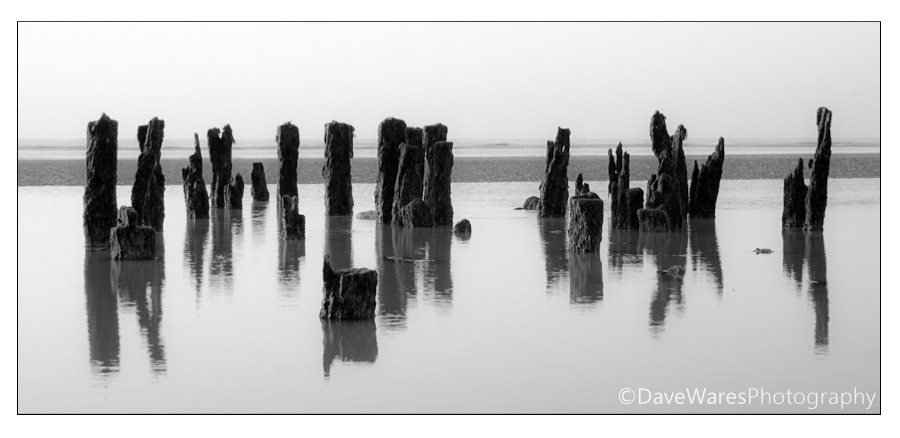
Not every scene will benefit from being presented in monochrome and in a lot of cases a picture can become too cluttered with the viewer not being a clear indication of where to look. So it’s time to train your brain into seeing in black and white even though we see in colour. The key to achieving a more successful mono image is to simply view the scene in terms of shape and contrast. It’s the same compositional idea that drives all photography and knowledge of basic composition ideas will give you a big head start. Look for bold objects such as a large boulder in the countryside or a fence that you can use to lead the viewer through the scene, or look for things that are in contrast to their surroundings. Lets take the image above as an example; the wood posts are virtually in silhouette against the overcast sky and bright water, so by placing the camera where I could see them arranged in a line I produced a simple yet striking composition, and with the sky being mostly overcast there was very little in terms of colour so the obvious thing was to remove it.
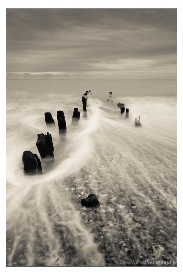 For this shot (taken on a different day) I applied the same principal as the top image, but as there was a lot of potentially distracting detail in the pebbles I decided to make the most of the tide. By using a neutral density filter I managed to slow my shutter speed in order to show movement in the water which in turn would slightly obscure the pebbles underneath. I also waited until the water started to return to the sea before tripping the shutter, and in doing so created more lead in lines from the drag of the water across the stones. As a side note, I used the cream tone preset in Lightroom as a starting point for the slight colouration of this image.
So how do we convert our images from colour to monochrome?
The majority of cameras these days have a Black and White mode that you can select and this is a very good way to instantly see how a scene will look, especially when starting out. I do however suggest you keep shooting in RAW mode as this contains much more information and although your shots will be in colour you will have more freedom later on in post processing to help produce a monochrome image to just how you want. In fact you can become very creative in post processing when it comes to monochrome imagery because you don’t only have to just remove the colour, you can also vastly change the entire look by specifying which colour channel (Yellow,Orange,Red,Green,Blue) you want to use (look for channel mixer in Photoshop), so don’t just select greyscale and be done with it. Different colour channels will weaken or intensify the grey tones from the original colour image. Each colour filter will lighten its own colour and darken its complimentary colour on the colour wheel, so by applying a particular colour channel you could darken a sky and lighten foliage for example. Other ways to convert to mono are (depending on your program of choice), ‘Covert to black and white’ in Photoshop elements, ‘Lab colour’ in Photoshop CS, or simply desaturating the image using the Hue/Saturation tool. Lightroom also has a good range of mono presets to help get you started. Each way brings its own characteristics so give them all a try. Another useful creative tool is the dodge/burn brush, found in both Lightroom and Photoshop. By using these two tools carefully you can lighten and darken specific areas within your picture to help certain elements stand out more. I highly suggest you look at the works of Ansel Adams and his book ‘The Print’, as he was the true mater of this technique.
I realise that this is barely scratching the surface of all the techniques involved in learning about monochrome photography but I hope it is enough to start you on your way.
*The Current Photographer website contains links to our affiliate partners. Purchasing products and services through these links helps support our efforts to bring you the quality information you love and there’s no additional cost to you.
Based on the south coast of England UK, I love to photograph landscapes and nature. In addition to this, over the past two to three years I’ve become fascinated with Urban Exploration and dereliction.
I’ve always had a passion for creating art, studying art and design during my school years and spending much of my time watercolour painting. After a brief love affair with playing rock guitar, photography was to be the next step in my creative life and I haven’t stopped since.
My photography has always been a continuous journey, constantly trying to gather as much information as I can to help push my photography to new levels and explore new avenues of creativity.
I love sharing the things I have learned and over the past few years
I have been an active committee member of a local camera club, giving occasional tutorials on photo skills and basic Photoshop techniques. I am also the proud winner of ‘The Portman cup’ for ‘Best Image of 2010′ at the Sussex Photographic federation’s Projected Digital Image competition.
Yes you truly right for this monochrome photography is totally different than all other photography. Might be your blog will help those people who actually want to take pictures in monochrome.