The digital age has definitely become a part of who I am, connected to the internet at every turn, but I am far from being an expert at any of it. Social networking, blogging, websites, etc. – I know a little about all of it, but that’s about it. If you’re similar to me in this way, then you can understand how difficult it was to go through the process of designing a totally new website. But I did it and am totally happy with the results (see for yourself here), so I thought it might be helpful to share some of what I learned with the other Jacks of all trades, but masters of none out there who plan to go through the same pain in the future.
Why?
You might be asking, “Why would someone who has been blogging for sometime now want to go through a total redesign?” That’s a great question and one that we should all address before actually going through with one. Jeremy Cowart was doing a website review for some of the folks at the Lifefinder Tour (Awesome – please go if you can) here in Minneapolis earlier in the year and the same thing kept coming up with each review – your website needed to reflect who you are as a photographer, not just the pictures you take. And it needed to do it quickly, because visitors are not going to stick around if they’re looking for something and you’re not showing it.
This hit me pretty square in the face being that my website was 100% my blog, which is primarily one picture a day and not one that interacted with the business I was trying to build (family and event photography). If my website was going to mean anything to helping my business grow, it was going to have to change. The decision was made.
The Brand
Unfortunately, this decision to do a redesign was just the start of the hard work. The next step was to decide who I was as a photographer and how to brand myself. I had never done that before and had put little thought to it, but if your website was going to be you, a decision needed to be made of who you are! The first thing we see and think of for most businesses is their logo or a trademarked product, neither of which I had, so that was the starting point.
For a long period of time, I tried to come up with my own logo design, but as stated in the first paragraph, I am no expert at anything so this turned out to be a spinning wheel kind of thing and lasted much longer than intended. I finally contacted a designer who had put together some of my friends’ logos and worked with him to get one put together. The key, once again, was for the logo to represent who you are. I needed something simple, photo related, somewhat informal (no BOLD type) but unique. I think we hit pretty much on the head.
Being totally honest, this was one of the biggest hurdles and sticking points in the process, but one of the most important ones. The logo represents you and will be on most everything that belongs to your website and/or business, so it’s terribly important and something to treat with respect and thought. For me, it also set the stage for the next step in the process: what the website was going to look like. The colors, type, and feel of the site should come right out of the logo, at least in my opinion, and that’s how I proceeded. But if I thought the hard part was over, I was incorrect.
Options
When it comes to website options, there are far too many and all of them are constantly updating their products to keep up with the market and their competitors, which is a good thing as a whole, but it makes the decision making process that much tougher! I liked the simplicity in design of the Squarespace type where you don’t have to go through a host service or know a whole lot of code, but these tend to get a little expensive and are limited in design flexibility. The self hosted route with WordPress sounded awesome from a cost and design flexibility standpoint, but the internet is filled with theme options and plug-ins and all kinds of other things I knew little about and likely needed to know in order to make the site work. Ugh.
A few free trials and countless theme examinations took place over the last several months and I came to a simple determination – much like photography gear, you get what you pay for. Free themes and sites looked free and were terribly limited. Higher cost sites and themes offered more flexibility in design. The key deciding factor in my decision? A great deal from the hosting service pushed me directly into the WordPress world. A world of endless themes and plug-ins and all kinds of other things I knew nothing about.
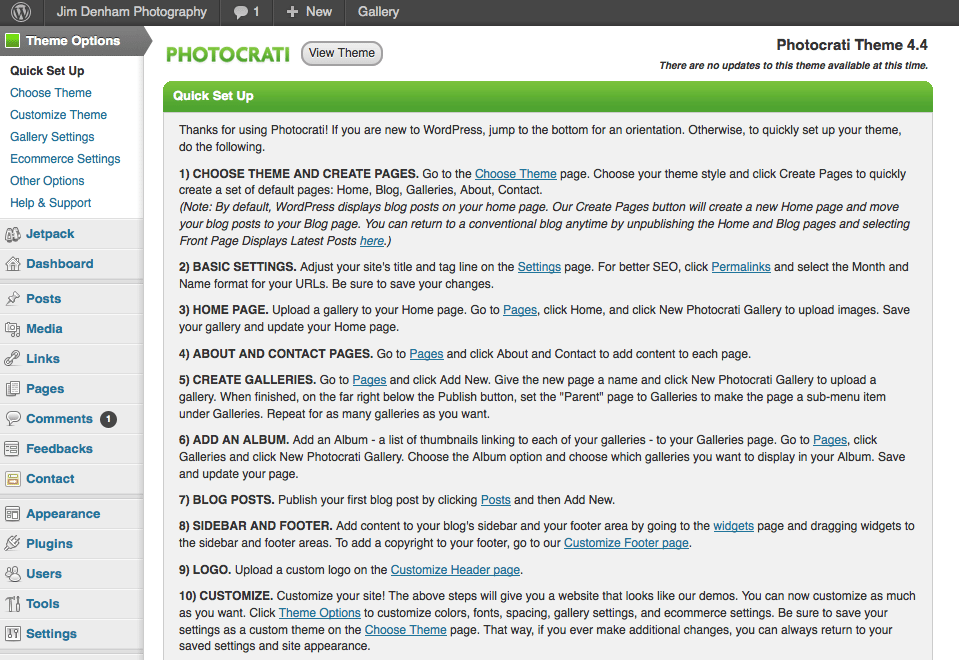
Thank goodness for Photocrati. Don’t know of Photocrati – check them out here. They’re WordPress based and offer a theme with 15 basic designs, each customizable to give about 60 total looks. The good news is that they offered a simple menu system within the WordPress dashboard to do the editing so that you didn’t have to know the code or even a whole lot about WordPress (although, that does come in handy) – you pick a color, select a background or choose a height. It was like plugging in the WYSIWYG system of say a Sqaurespace into the design capabilities of WordPress. The initial cost of the theme was a bit high, but it was a one time purchase and brought with it the ability to change the looks of my site immediately without having to buy another theme – I already had 15 in hand.
Below you can see the Photocrati Quick Start Menu and how it looks within the WordPress dashboard.
From here, it was just making changes within the theme or WordPress to make the site look and feel in a similar manner to my logo and the brand intention. There were still quite a few issues to work out and a lot of learning about plug-ins and moving around in WordPress, but for the most part, I’d found the tools, products and design that best suited what I was looking for. Once the logo was in hand, it only took about two weeks to get the site up and running from a day-to-day perspective.
What Was Learned?
Here’s the thing, we’re all wired differently, so what works for one person may be totally wrong for another. Here’s some bullet points of learnings and recommendations, take them for what they’re worth:
- Before looking at hosts, themes or anything else, determine why you need in a website, what you want it to do and how you would like it to convey who you are. Do you need ecommerce? Private galleries? Forums? What type of photography do you want a visitor to connect to you? Have all of this stuff planned out before going about searching the correct site/host/theme – it could help narrow down the options. Also, how much money are you willing to spend?
- Establish your brand design (if you have or want one) before hunting – it just makes it easier and quicker once you decide what site type you’re going to use
- How much work are you willing to put into the design? Are you willing to learn how to work around a somewhat complex WordPress system or would you prefer a ready made template and WYSIWYG controls like Squarespace?
- You get what you pay for, mostly
- Don’t be afraid to ask questions form the host sites, themes or friends that have already been through it. I used Blue Host and Photocrati and they both have been outstanding in answering my questions and helping me out of jams. I’m sure most others will do the same. Look at reviews for the services you’re considering and see what others say about them.
- Take advantage of free trials and spins at some of the non-Wordpress players like Squarespace. It may suit your needs better than self hosting.
- During the design process, test the site with some folks who will be honest with their feedback – this helps a lot in fine tuning.
- If at all possible, use a custom domain that works to connect your brand to the site – every little bit helps!
All I can say is that the daunting task of redesigning and rebuilding my website is done. I love how it looks and works and it took less time and effort (and stress) once I found the right tools that suited my needs and capabilities. These same tools may not work for you, but I highly recommend them based on my experiences. Feel free to contact me (see below) to ask any questions – I might not be able to answer them but will do my best. Good luck in your endeavors to make your website match the same one that’s behind your eyes!
*The Current Photographer website contains links to our affiliate partners. Purchasing products and services through these links helps support our efforts to bring you the quality information you love and there’s no additional cost to you.

Landscape and fine art photographer based in Lexington, Tennessee – that’s right, Tennessee! Love of long exposures, black and white and film photography. Social networking junkie and love geeking out about everything photography! Husband to Laura and father to Sam. Well, there’s Doc the dog too!

