When it comes to film, I tend to lean towards two things: people and black and white – there’s no duplicating portraits taken with classic black and white film. With that said, I will still, on occasion, slap some color negative film in the camera just to try it out and see how it performs. Kodak Portra is one of the more popular color films for portraits and my experience has been pretty good with it, but it may have just met its match for my goto color portrait stock.
Agfa Vista Plus 200 is a relatively cheap, 200 speed color negative film – you can get a 36 exposure roll for under $5. It does not match up property-to-property with Portra, but it does work really well in certain areas that allow me to overlook its shortcomings. Let’s take a look.

Three rolls of the Agfa Vista Plus 200 were ordered and shot, two rolls were put through a Canon Elan 7 with a Canon 28-90mm kit lens. The other roll was used in a Canon AE-1 Program rigged with a Canon FD 70-210mm f4 lens. Both were shot at the recommended metered exposure in the camera and at the film’s recommended speed of 200 ISO – no pushing or pulling in development.
Even though all rolls were shot at the cameras’ suggested exposure settings, both produced different results, in general, overall exposure. The Canon Elan 7 + 28-90mm lens combo produced a slightly underexposed image, but also generated a more saturated image. The AE-1 Program + 70-210mm lens setup produced images with very good detail in the shadows and mid-tones, but tended to overexpose the highlights, especially in frames with a high contrast range.
This highlights one of the limitations of the film – dynamic range. There’s not a lot of wiggle room for exposure – you either overexpose highlights or you get deep blacks and high saturation – not much in between. Even though this seems like a big deal, the sharpness of the properly exposed areas, especially through the AE-1 Program setup, are very pleasing and the blown out highlights don’t seem to take away from the image. This is most certainly a personal observation and other photographers may not like this ‘limitation’. To each their own – the beauty of photography.
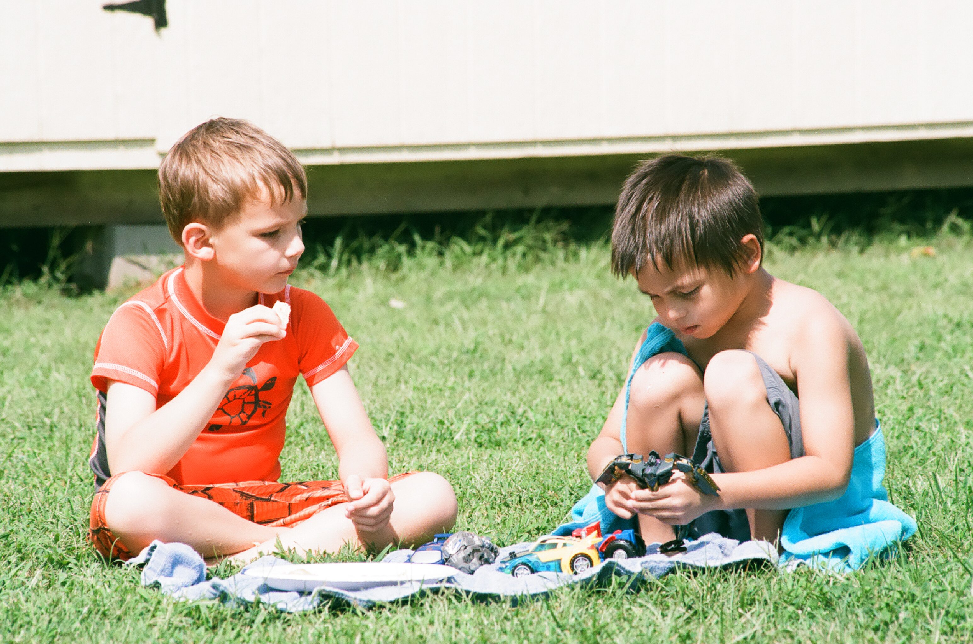
The image above is one where the highlights were mostly overexposed. These are two of my great nephews who hadn’t seen each other since they were in diapers up until they met at my house this past Labor Day! I loved that they were off on their own but the bright background, and even some of the light on their skin, was just too bright in the mid-day sun. The details, however, look good and for me, the image still works very well.
When the light evens out, like in the portrait of my brother below, the detail really shows out. So for mid-day sun, slightly underexposing may be the way to go, while exposing with the camera’s meter in overcast or even light situations works really well.
Being a relatively slow film having an ASA speed of 200, one would expect the grain to be pretty fine and not have a big impact on the image, which is the case. Below, the portrait of my brother is a 1:1 zoom in Lightroom of the same image. There is grain for sure, but it’s very smooth and holds little impact in the image. The detail is still so good that the pop can reflection in his sunglasses is easy to make out!


One of the best qualities of the film is the color. Take a look at the image below of my great-nephew Grayson. His skin tones look very nice while the orange of his clothes and the blue of the pool are quite saturated and vibrant! This is where the film stands out in my opinion. The colors, even when overexposed, still look beautiful and unique.

It’s not all perfect though. reds and greens tend to be a bit strong with this film, especially when underexposed. Below is a picture of my wife and oldest brother taken with the Canon Elan 7 – it was overcast and the image is slightly underexposed. The detail and overall colors are beautiful, but there’s a little red in my wife’s cheeks and the green in the trees behind is a bit strong.


The image above of my mother was taken with the AE-1 Program and you can clearly see a strong green tint in the ends of her hair and the background.
Even with the flaws, the main thing I like about this film is its uniqueness. The combination of color and details just works for me and makes for great color portraits. Kodak Portra is more predictable and the colors are definitely cleaner, but, for me, having a unique look to film is much more desirable than having a film that looks, normal, or digital.
Who Is It For?
The saturated colors, in my opinion, label this film as more of an artistic grade of film rather than a professional grade. If you’re a wedding or family portrait photographer, it may make more sense to stick with tried and true grades that yield predictable results with really good tonal range. Some of your customers may like the AGFA look, but my guess is, most will want the best exposure and expected results. It’s not fast enough for low light or high speed applications either.
However, this film would work well with casual and artistic portraiture and for those operating on a limited budget. The dynamic range can limit the film’s ability to take landscape images, but could be good in combination with ND filters to even out the range. Even more so, those photographers who just love to have fun taking pictures should enjoy this a great deal! Fun is allowed – I assure you! The finished images are beautiful, vibrant and sharp!
Conclusion
People and film – for me, they go together. Most of the time, that’s in classic black and white, but not 100%. When I do go to color, I want the images to be vibrant and unique and the AGFA Vista Plus 200 delivers both, along with detail and sharpness. It’s slow and a bit more saturated than most professional films, but I’m not shooting film professionally, so it works for me. That may not be the case for you, but if it is, this film can generate fantastic images at a fraction of the cost of professional grades. That means more images per dollar spent – more images is good!
As much as I enjoy this film, it is like any other piece of kit in the bag, part of the toolbox you use to produce the images you envision. Don’t take my word for it – go out and shoot it! Shoot Portra, Fuji or anything else you can get your hands on! Compare the grain, the speed, vibrance, skin tones, etc. See which one suits your vision. Find the color film that works best to produce the images that are behind your eyes!
*The Current Photographer website contains links to our affiliate partners. Purchasing products and services through these links helps support our efforts to bring you the quality information you love and there’s no additional cost to you.

Landscape and fine art photographer based in Lexington, Tennessee – that’s right, Tennessee! Love of long exposures, black and white and film photography. Social networking junkie and love geeking out about everything photography! Husband to Laura and father to Sam. Well, there’s Doc the dog too!
It’s a Fuji C200 rebrand
Thanks Shaun! That was something I had heard but did not know enough to confirm – appreciate your input!