![]() To be successful in todays times, all photographers need to be online and involved in social media. I always recommend having at least a blogsite to display your work and post articles that would be of interest to your clients, a Facebook profile and business page, and an active Twitter presence. In this tip I’m going to show you how to build a great looking, functional and branded Twitter profile page for your photography business.
To be successful in todays times, all photographers need to be online and involved in social media. I always recommend having at least a blogsite to display your work and post articles that would be of interest to your clients, a Facebook profile and business page, and an active Twitter presence. In this tip I’m going to show you how to build a great looking, functional and branded Twitter profile page for your photography business.
First off, if you aren’t already on Twitter sign up for a free account. When selecting your username try to get your real name (ex. JohnSmith). It’s very possible that your name may be taken so try other variations (ex. John-Smith, JSmith, etc.). If your name isn’t available then try to use your business name. The right user name plays a very important part in your personal and business branding so make sure it reflects how you want to appear to your potential clients.
Setting Up Your Profile
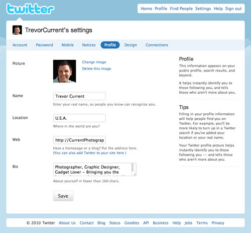
1. Log in to your account – Then click on the “Settings” tab at the top and then the “Profile” tab under your
user name.
2. Picture – It’s important to have a profile picture that reflects your brand. If you’re using your own name as your Twitter ID then I would suggest using a photo of yourself (happy smiling faces are more inviting than dark serious ones). If you’re using your business name as your Twitter ID then your company logo would be ok as long as it is recognizable at a small size. In Photoshop or another image editing program, crop your photo so it is 300 pixels x 300 pixels square. This will reduce down very nicely and also make for a nice enlargement should someone click on it in your profile page.
3. Name – Fill in your real name. It’s all part of the branding thing!
4. Location – Filling in the town or region you live in will help people find you.
5. Web – VERY IMPORTANT! Fill in the address of your website/blogsite. I see a lot of people using short urls here so they can track the clicks, don’t do that! It doesn’t look professional, it takes away from your branding and a lot of people are hesitant to click on short links from people they don’t know.
6. Bio – This is also very important. You only have 160 characters so be as short and descriptive as possible. If you are a wedding photographer from New York City make sure you include that in your description. The more info you can provide, the greater your chances are of being found.
7. Save – After you have entered all your information click the “Save” button at the bottom.
–
Designing Your Profile Page Background
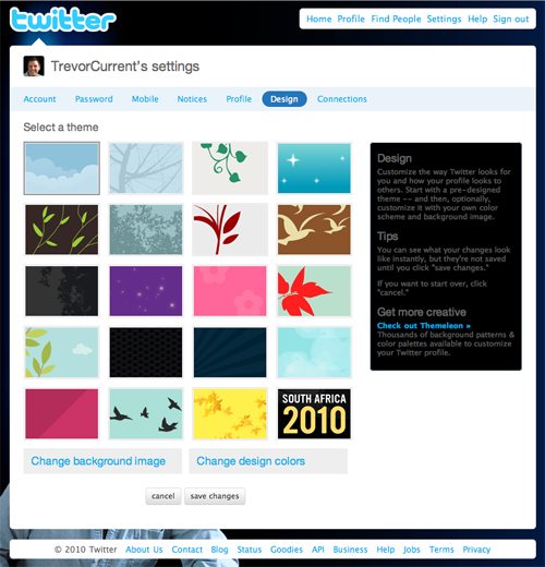
1. Click on the “Settings” tab at the top and then the “Design” tab under your user name.
2. Select a Theme – Twitter gives you a number of themes to choose from. Selecting one of the pre-designed themes will automatically set the background image and colors of the text and other page elements for you. You can use one of these to get started but I don’t recommend using it for the long term. In the next steps I’ll walk you through building your own custom branded theme.
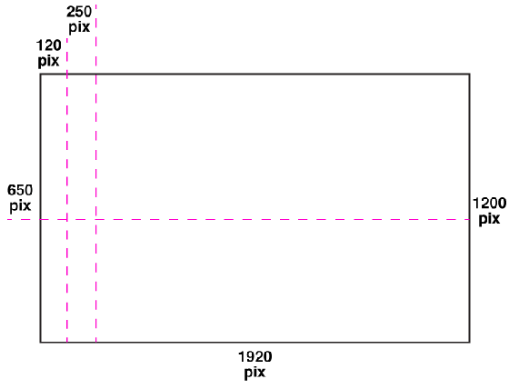
3. Create Your Custom Background Image – Let’s start by creating our background image. You’ll need an image editing program like Adobe Photoshop for this process. Create a new RGB document at 1920 pixels wide x 1200 pixels high with a transparent background. This is the pixel dimension that most large monitors use, so if the viewers web browser window is fully expanded, your background image will fill the entire screen.
4. Visible Image Area – Next place a vertical guide 120 pixels in from the left and another 250 pixels in from the left. Place a horizontal guide 650 pixels down from the top. This upper left corner is what will be visible on most screens. You’ll want to keep your most critical information in the 120 pixel x 650 pixel space.
Below are examples of how my Twitter page looks on different screen sizes. The page was built to the above dimensions.
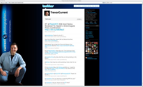
23″ Apple Cinema Display – 1920 x 1200 Resolution

14.1″ iBook – Resolution 1027 x 768 | 13″ MacBook Pro – 1280 x 800 Resolution
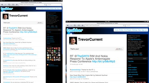
Apple iPad – The iPad automatically enlarges the Twitter page so just the main content shows. The background image is cropped
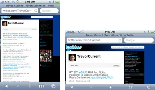
Apple iPhone 3Gs – The iPhone automatically enlarges the Twitter page so just the main content shows. The background image is cropped
5. Design – Here’s where you get to play and try different things. Since design is so subjective, I’m just going to give you a few thoughts to keep in mind while you’re creating your masterpiece.
- You want to create a branded look for your Twitter page. It should have a similar look and feel as your website, brochures, business cards, etc. If you don’t have a uniform look for your business, now is the time to start. (I’ll be talking more about developing your brand in an upcoming article.)
- Any copy or images that you want to be seen should be in the upper left 120 x 650 pixel area. Any secondary elements can extend out to the 250 pixel vertical guide.
- Include your business logo and make sure it’s large enough to see. If your logo is very horizontal like mine, try rotating it 90º (the left side of the logo should be down, so the bottom points towards the center of the page). It may look better than just reducing it to fit.
- Work your company colors into the background. Use web safe colors as they will display the best on screen and take note of the color’s hex number (the 6 digit alphanumeric number next to the swatch) that you use for the next section.
- I would stay away from putting copy on your background like web addresses, email, Facebook page, etc. The text will not be a clickable link and the added elements can really busy up your design. If a viewer wants to learn more about you they’ll click on your web link at the top of the page.
- Incorporating some of your photography into the background can work out great, just remember most of the image will be hidden behind the main content box that measures 760 pixel wide.
- I’ve seen some backgrounds with logos, copy and other elements on the right side of the page. This may look good on screen while you’re designing but, chances are your page will never be viewed this way. Most users will size their browser window to fit the main Twitter box, cutting off your graphics. Keep the right side simple and clean.
- When you’re finished save your file as a .gif, .jpg or .png file. If your design contains only solid colors, a .gif file may work best. If it contains photos or color gradations, save it as a .jpg or .png. The final file can’t be larger than 800k, if it is you may need to make some adjustments to the image quality.
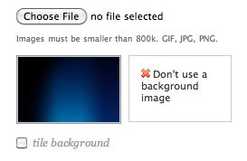 6. Change Background Image – Now that you’ve created your background you’re ready to upload it to Twitter. Under the “Design” tab and below the pre-designed theme options, click the “Change background image” button. The window will refresh and give you an option to upload your own custom background. Now click the “Save changes” button at the bottom.
Changing the Layout Colors to Match Your Design
1. Under the pre-designed themes click the “Change design colors” button. The window will refresh showing the current colors used for the background, text, links, sidebar and sidebar boarder.
2. Click on the background color swatch to bring up the color picker. You have the option of mixing your own color or you can input a 6 digit hex number. Pick a color that matches your background image as close as possible. That way if someone with a 30” display decides they want to expand the browser window all the way out, they won’t see the edge of your graphic.
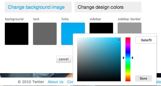
3. Now select a color for your text and the other remaining elements. If you can, use the hex numbers from above to really help tie your theme together.
4. When you’re happy with the look click the “save changes” button at the bottom.
Next Steps…
Follow the steps above to create your Twitter account, set up your profile and design your page, and you’ll be on your way to a branded look for your photography business. If you have any questions about creating your page or would just like to have some community feedback, leave a comment below with your Twitter username and we’ll check it out. Be sure to check the “Notify me of followup comments via e-mail” box to keep up with the conversation.
UPDATE: Since publishing this article, Twitter has changed their page layout for the “New Twitter”. I will be creating a follow up article to reflect their new changes.
If you’d like to get more tips like this one, be sure to sign up for our FREE Weekly Tips to Help You Grow and Enhance Your Photography Business.
–
*The Current Photographer website contains links to our affiliate partners. Purchasing products and services through these links helps support our efforts to bring you the quality information you love and there’s no additional cost to you.
Founder of Current Photographer, co-host of The Digital Photography Cafe Show, Designer, Photographer, and overall tech geek.
This is extremely useful and precise info. Thanks for sharing!
Very interesting. I found your blog on bing and will bookmark it now. Keep up the great work.