One of the most common questions that I get asked by readers is how does While Balance and Color Profiling play into my HDR work flow. I think it is an extremely valid question to ask and it is critical that you address in your own work flows. Unfortunately, I don’t think that many people consider this when shooting brackets. So, I wanted to add this blog post that I wrote for X-Rite some time ago and breathe new life into it. I hope it helps give you a better idea of how integral it is to achieve correct white balance and color profiles.
As photographers, we all have stories about how we have grown, refined, and crafted our individualized techniques, all with the goal of capturing the best picture that is within our means. For me, it has been more of an evolution than actual growth. It wasn’t so much building on top of what I knew as it was morphing it into something different. It was about addressing a mental itch and experimenting with all sorts of deviations until I took my next evolutionary step in digital photography. And that is how I found myself truly immersed in High Dynamic Range (HDR) Imaging.
HDR has gained a lot of attention recently, almost to the point where it is becoming a mainstream term in photography. Because your camera’s sensor is not nearly as sophisticated as your eyes are in visualizing a scene with lots of tonal range (all of the transitions from the brightest highlights through to the darkest shadows), HDR helps facilitate this limitation by taking the exposure detail across several ‘bracketed’ images and brings them out via tone mapping. It is a very remarkable processing technique, and as is the case with most good things, it can be easily abused, especially when first entering the foray of HDR imaging.
Like all evolutionary trends, I started with HDR very primordially. I fumbled with haloes and noise. With crazy, saturated color and blown out tones. But with each attempt, I found myself getting closer and closer to really understanding this technique, one that truly is greater than the sum of its parts. And with my processing style evolving, so did my eye for HDR. It was the next step in my evolution. No longer would I bracket everything that found itself on the business end of my lens. I was beginning to understand what sort of images would truly benefit from the rigors of the technique.
My most recent evolution brought me to a very granular place within photography. It had to do with achieving proper color and tone. Ensuring that the foundation of what I would be building on was correct and true. And it happened with the creation of the ColorChecker Passport. With the Passport, I can now bring assurance and consistency to all of my shots, across any range of lighting conditions that I find myself in. It provides me with flexible, custom White Balance options with its Creative Enhancement Target. It also gives me the ability to create custom DNG Color profiles using the 24-Patch ColorChecker Classic, allowing me to apply them to my bracketed images prior to tone mapping.
What I love most about the Passport is its ease of use as part of my workflow, both in behind the camera and in front of the computer. It really is simple. The first shot I take is always of the Passport. Changed a lens or major shift in lighting? Shoot the Passport. Doing this ensures my ability to apply correct and consistent color and White Balance to every shot that will compose my HDR image.
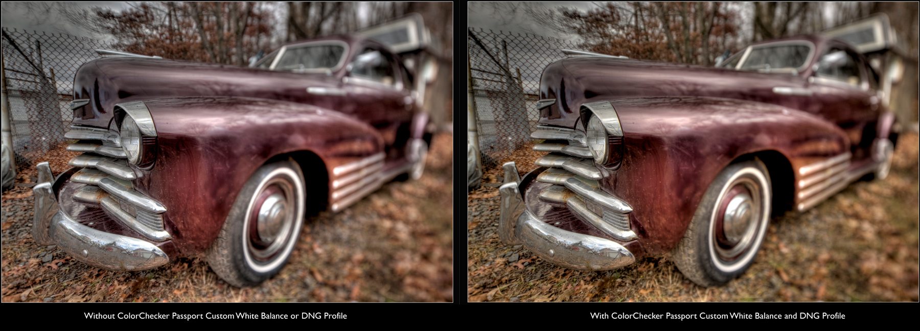
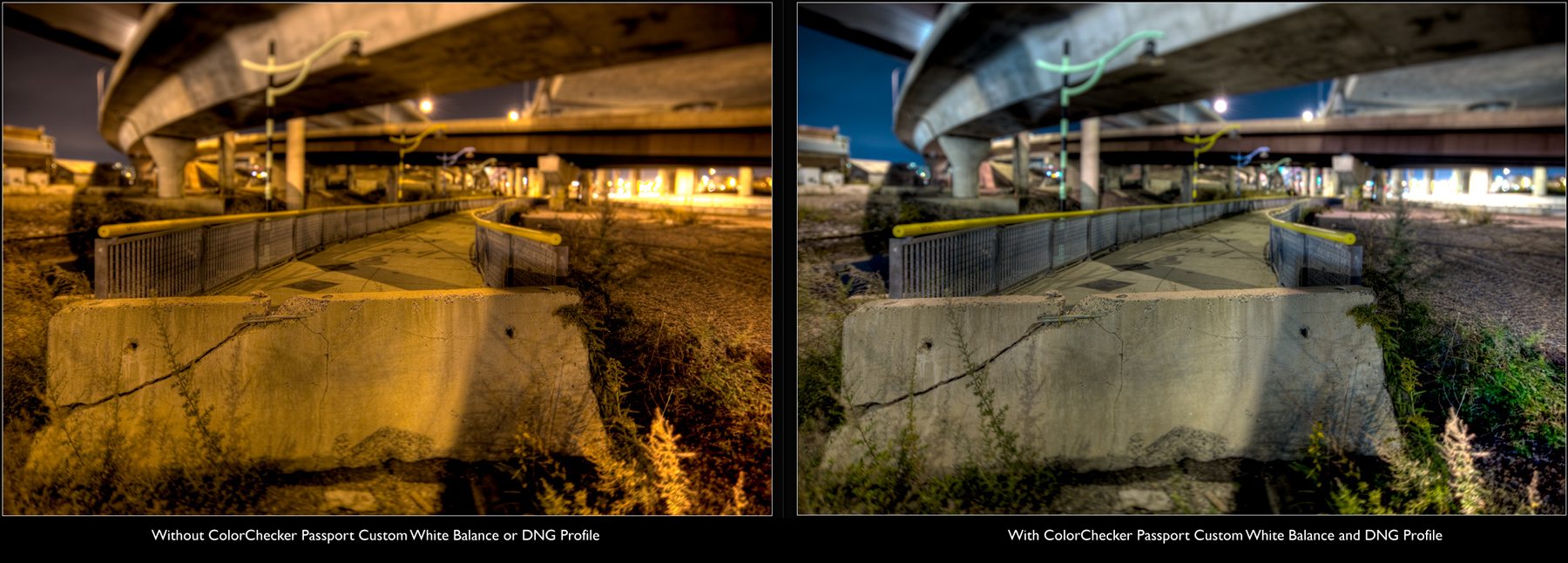
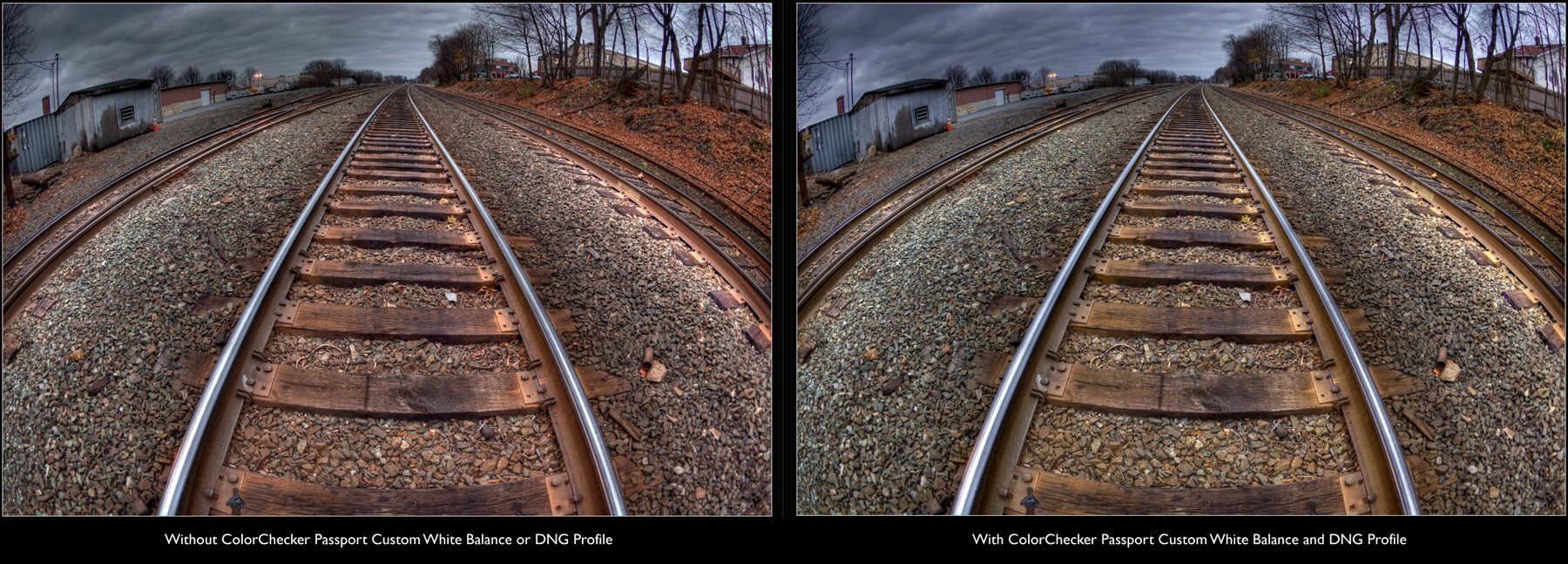
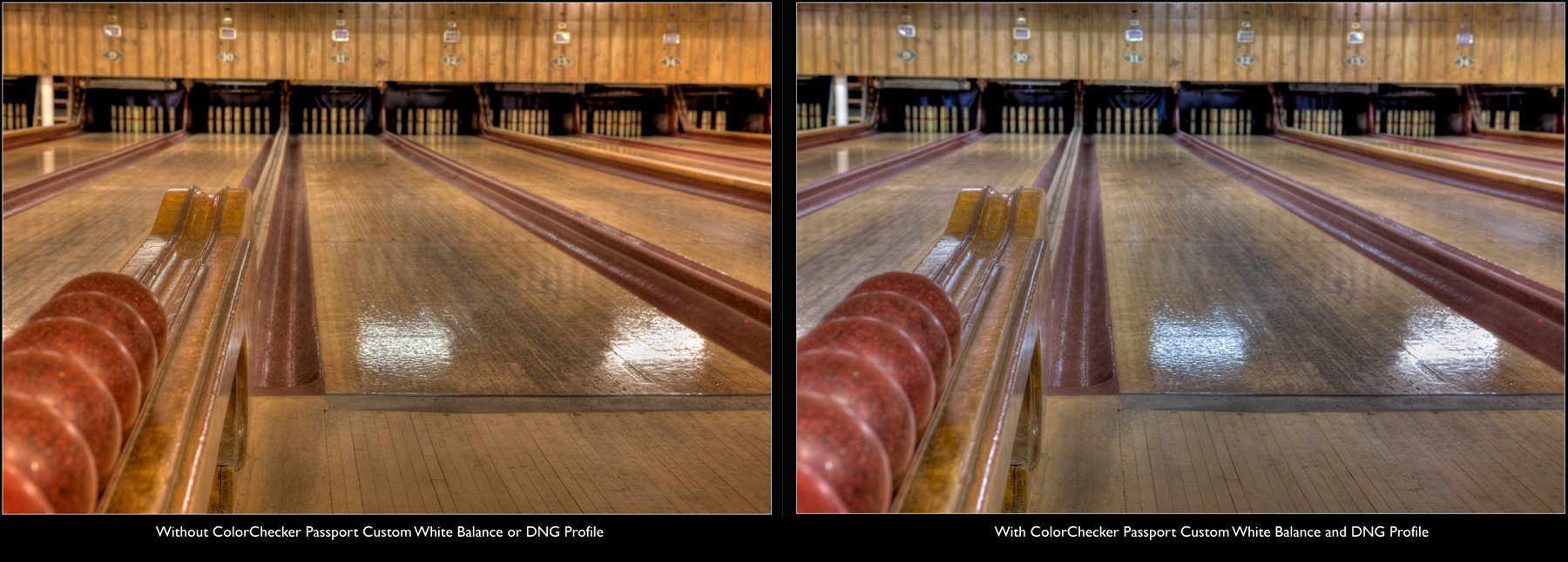
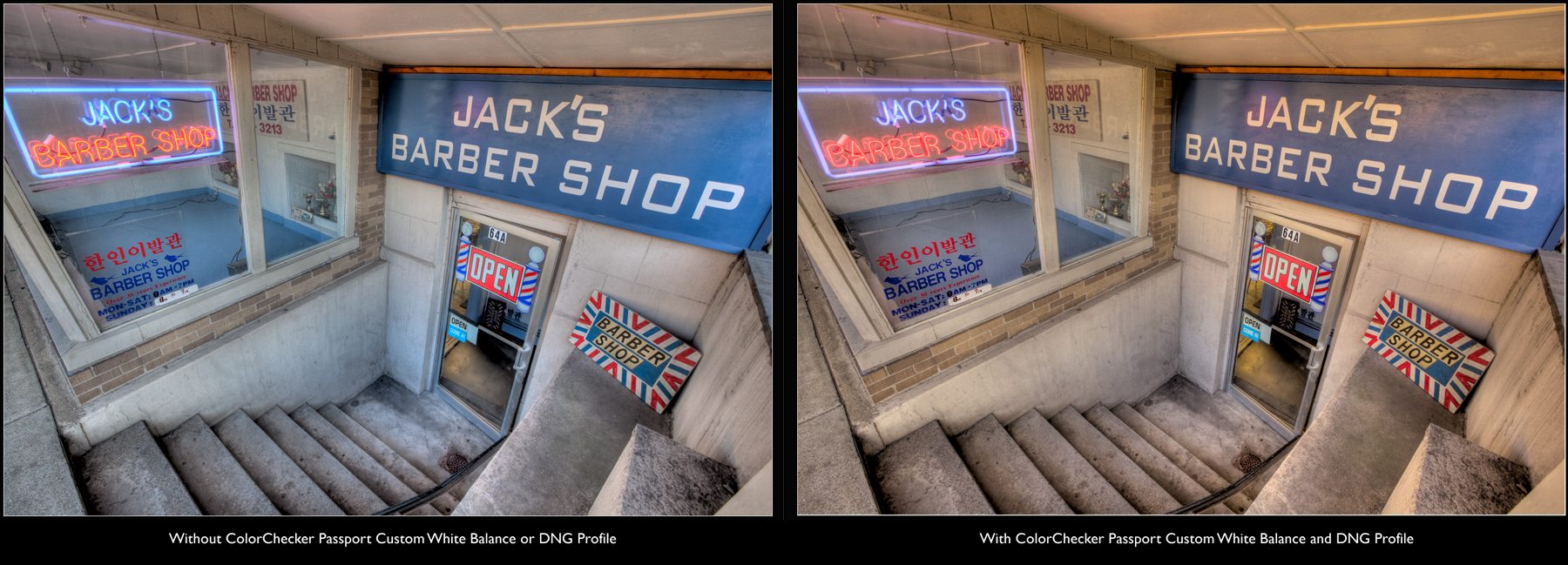
I have conducted extensive tests and comparisons using identical HDR work flows. The first test did not incorporate any aspect of the Passport (no custom White Balance nor DNG Color Profile). This test is indicative of how large majorities of people shoot and process today, giving very little (if any) thought to achieving correct color and White Balance. The second test incorporates a custom White Balance and DNG Color Profile, both derived from the ColorChecker Passport shot from that scene. The results, while subtle at times, provided noticeable and marked improvements to my base HDR image. I found that the colors in the image were more representative of the actual scene and the tones were much truer and accurate than the non-color managed version.
And then it hit me. If applying the Color Management to my workflow increases my image quality by even just 2%, it is still that much better than if I hadn’t applied it. And with the hundreds of thousands of images shared on Flickr, and other similar sites, it could just be that extra 2% that makes your image stand out amongst the masses.
I hope that this article helped spur some thought around this very important, and often neglected, subject of photography. Feel free to leave some questions or comments about what your thoughts are on either the pain points or virtues of ensuring proper White Balance and Color Calibration. Also, feel free to share your own tips for others to learn from and grow.
X-Rite and Photographer Joe Brady put together a great video that illustrates how the ColorChecker Passport fits into his work flow. You can check it out here.
![]()

Photo Credit: Chris Halford
Brian Matiash is commercial architecture photographer, writer, and lover of all things social media. When he is not out photographing the ever-shifting trends of exterior and interior design, he is roaming around and exploring the city to capture the forgotten corners and loose ends that so often get overlooked. You can see daily offerings from these explorations on his blog.
Brian has spent the past several years learning and mastering the use of High Dynamic Range (HDR) imaging to provide his photos with a level of realism not normally captured with conventional photography. He is the author of recurring HDR columns on CurrentPhotographer.com and ProPhotoResource.com , where he shares tips, tricks, and techniques to gain the most out of HDR photography. He is also an editor of HDR Spotting , the leading gallery/resource dedicated to showcasing HDR images. Brian’s HDR images have been published in a variety of news and magazine publications, as well as displayed in various art galleries in Boston, MA and New York, NY.

Email: photos@brianmatiash.com
Webiste: http://brianmatiash.com/
Blog: http://brianmatiash.com/blog/
Twitter: http://twitter.com/brianmatiash
Facebook: http://www.facebook.com/brianmatiash
Here’s how you can share your tips, techniques and tutorials on CurrentPhotographer.com
–
*The Current Photographer website contains links to our affiliate partners. Purchasing products and services through these links helps support our efforts to bring you the quality information you love and there’s no additional cost to you.
RT @TrevorCurrent: The Importance of Correct White Balance & DNG Color Profiles for #HDR Images. https://currentphotographer.com/the-impor… #photography #p …
RT @TrevorCurrent: The Importance of Correct White Balance & DNG Color Profiles for #HDR Images. https://currentphotographer.com/the-impor… #photography #p …
RT @TrevorCurrent: The Importance of Correct White Balance & DNG Color Profiles for #HDR Images. https://currentphotographer.com/the-impor… #photography #p …
RT @TrevorCurrent: The Importance of Correct White Balance & DNG Color Profiles for #HDR Images. https://currentphotographer.com/the-impor… #photography #p …
RT @TrevorCurrent: The Importance of Correct White Balance & DNG Color Profiles for #HDR Images. https://currentphotographer.com/the-impor… #photography #p …
@trevorcurrent Sometimes a correct/accurate white balance is not always the desired one. Artistic license. 🙂 #togs #HDR.
RT @TrevorCurrent: The Importance of Correct White Balance & DNG Color Profiles for #HDR Images. https://currentphotographer.com/the-impor… #photography #p …
RT @TrevorCurrent: The Importance of Correct White Balance & DNG Color Profiles for #HDR Images. https://currentphotographer.com/the-impor… #photography #p …
RT @TrevorCurrent: The Importance of Correct White Balance & DNG Color Profiles for #HDR Images. https://currentphotographer.com/the-impor… #photography #p …
@RoshSillars @TrevorCurrent As long as correcting the white balance is not detrimental to the aesthetic of the scene. Artistic license. 🙂
@Lensflaredave @RoshSillars Agreed! 🙂
@RoshSillars @TrevorCurrent Product photography of course requires accurate colours. So it is the end purpose that dictates ones methods.
RT @TrevorCurrent: The Importance of Correct White Balance & DNG Color Profiles for #HDR Images. https://currentphotographer.com/the-impor… #photography #p …
RT @TrevorCurrent: The Importance of Correct White Balance & DNG Color Profiles for #HDR Images. https://currentphotographer.com/the-impor… #photography #p …
RT @TrevorCurrent: The Importance of Correct White Balance & DNG Color Profiles for #HDR Images. https://currentphotographer.com/the-impor… #photography #p …