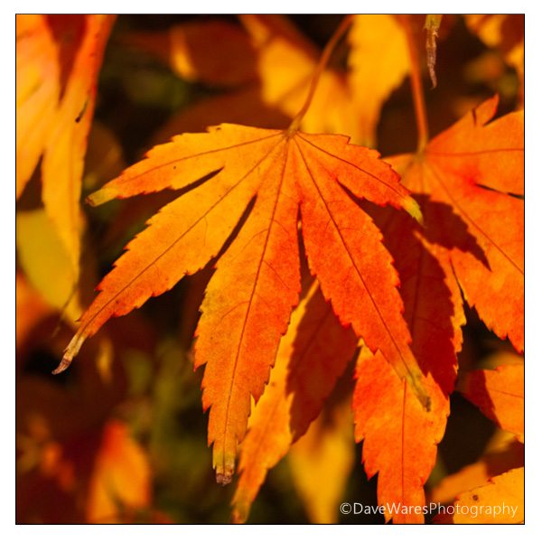
Colour or monochrome? Always a tough decision, but sometimes you don’t need to make that call – you can have a bit of both. Colour-popping – the retention of colour saturation in one part of a monochrome image – is becoming more and more popular.
Traditionally, the colour-pop effect could only be applied when using an image editor that supported multiple image layers, such as Photoshop Elements. Recently, a number of colour-popping specialist apps, particularly on touch-screen devices, have emerged, and the newest kid on the block is Color Splash Studio (at the reduced price of $1.99/£1.49 at the time of writing), from Macphun (makers of the previously reviewed FX Photo Studio).
Like FX Photo Studio, Color Splash Studio has a sleek interface, and is a swift operator. Drag & drop your image into the app, and you’re ready to start painting in colour. The opacity, size and hardness of the colour-painting brush can be adjusted, and painting is seemingly not as fiddly as in some apps – this may have something to do with the unobtrusive brush cursor. Additionally, both the painted and non-painted layer are adjustable in their colour, contrast, exposure etc. Via these adjustment sliders, it’s possible to make a subtle colour-pop effect, where non-painted areas are just slightly desaturated, rather than being converted to monochrome – producing an effect that is less “in-your-face.”


Mark Myerson loves photography, and in particular, hanging around waterfalls! Landscapes and nature have always been his staple, but he relishes any opportunity to take pictures. He also works closely with many local charities, regularly providing photographic coverage of fundraising events.
Mark is also a self-confessed tech-head and OSX lover – Apple is his favourite fruit!
Mark is the owner of Mark Myerson Photography, a Devon-based business that provides a large variety of photographic services to the local community and beyond. Whilst Mark Myerson Photography specialises in event, commercial and pet photography, almost every type of photographic assignment has been covered by the company.
If you have any photography or OSX-related questions, you can contact Mark via the links given below.