Archive for landscape

Scenic Outlook – 3 Easy Ways to Not Look Like an Amateur

Amateur (noun) – a person inexperienced or unskilled in a particular activity

I think we can all agree that the definition of amateur doesn’t exactly have the nicest ring to it. A lot of photographers out there do fit this description, which is perfectly fine or everyone with a camera would be doing this for a living. The trick is not letting other people know it. There are difficult methods for your images to look like a pro’s but also very easy ways to NOT look like an amateur. I have seen countless photographs of beautiful sweeping landscapes and majestic sunsets only to be ruined by the simplest (read: careless) mistake. The three things I am about to cover are major pet peeves of mine that will instantly drop an image from the ranks of great to mediocre. My goal is to have you think the same thing by the end of this article. Remember, our work doesn’t have to stand up to the likes of Ansel Adams, but it does have to be better than that guy snapping away with a disposable camera. These tips are easy and you CAN do this.

Straight horizons

Number one. Numero uno. The be all end all. I can probably go on for days how crucially important this is but I will spare you the diatribe. Just repeat after me: I will make sure my horizons are straight. Very good, you are already on the non-amateur path. My advice is simple; take your time composing and framing your shot. There is a simple approach I take every single time I compose a landscape image to make sure my horizon is straight. Get this right in camera and you won’t have to straighten and crop part of your scene later. If you are using a DSLR, place it in live view mode once it is secured to your tripod and enable grid lines if they aren’t already. Take your time adjusting the angle of the camera until the lines show a perfectly straight horizon. Remain in or cancel out of live view and snap your shot.
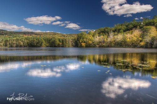
It was imperative that my horizon was straight for this image given that I was playing off of symmetrical reflections.

Dead center is dead boring

Being that we are already on the topic of straight horizons, lets keep the mojo going with another absolutely crucial non-amateurish tip: avoid centering your (now) perfectly straight horizon. Don’t get me wrong, there are times when a centered horizon will work, but for the most part that isn’t the case. When there is equal space above and below a horizon line, your eye wanders looking for a place to focus on in the frame. Our eyes are followers and need to be told visually where to go. As a general rule of thumb, if you want to emphasize a really dramatic sky, lower your horizon. If the foreground is the main point of interest and you are faced with a so-so sky, raise the horizon to the upper third portion of the frame.
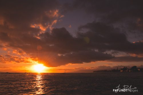
The only reason this image works and has any impact is because the sky is dominating the frame. Your eye is led by the reflection in the water, to the sun, then traverses around the dramatic sky.

Dust it off

Step 3 in the non-amateur program: dirty sensors. It happens to the best of us. Well, actually, it happens to all of us. Sensor dust is part of the game whenever you are changing lenses and for the most part, it’s unavoidable. Dust spots will be the most present in the under exposed areas of your image, but they are easily abolished. The first thing I do when processing a photograph is look for dust spots. Sometimes I will spend 5-10 minutes making sure I took care of every single one because to me, a single blemish can ruin a photograph. Inspect your shot from every viewing angle on your monitor. Some spots are only visible from the sides or straight on. Then use content aware fill or a healing brush to rid your image of those nasty specks.
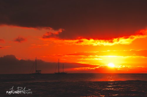
In order to maintain all the detail in the sky and silhouette the distant boats, I under exposed this shot. With that, dust spots were present throughout.

Congratulations! You have now completed the 3 step program. With some simple care and attention to detail, you can avoid the amateur tag and start taking your work to the next level.


–

Jesse PafundiJesse Pafundi is a photographer hailing from Long Island, New York. A lover of all things photography, he enjoys traveling and capturing the world around him as much as possible. In addition to shooting landscapes, he has a major affection for New York City architecture and urban exploration. Whether it’s HDR, lens filters, or iPhoneography, he enjoys dabbling in and learning as many techniques as he can consume. Jesse believes strongly in the use of social media and blogging as a tool to further his knowledge and share his passion with anyone who wants to listen.

Photo Credit: © Jesse Pafundi

Here’s how you can share your tips, techniques and tutorials on CurrentPhotographer.com


OSXcellence – The Photographer’s Ephemeris for Mac Review

Unlike many of the apps I review in this series, today’s is neither new on the market, nor new to me. In fact, I have been using it for years now, so it’s about time I shared the brilliance of The Photographer’s Ephemeris (TPE) with you.

This app provides accurate prediction of sun and moon positions at a given time, in relation to a location on the inbuilt version of Google Maps. A simple function it may seem, but for any photographer who needs to work with the sun’s light, TPE provides a unique and incredibly useful utility.

TPE has a very polished interface, with period-style visual details, providing a beautiful accompaniment to the app’s purpose. The main focus is on the Google Maps area, where you navigate to the location of your shoot – a search bar is provided at the bottom to ease this, as is a favourite locations list – and then hit the marker button to see the line of the sunrise and -set, and the moonrise and -set in that location. In addition, you can see this data for, seemingly, any date in the future, and information on the timing of the rise and set events is included on the right of screen.

Read More→

Scenic Outlook – Embrace Manual Mode

Modern cameras are truly wonderful devices, every time a new one comes out it’s seems to be packed with more and more cool stuff to temp you into parting with your cash. Of course many of these features can be quite useful in certain situations but for the most part a good proportion of functions will rarely be used. This is very true for the landscape photographer. Sturdy build, good glass, a decent viewfinder, a reliable light meter and the ability to alter the aperture and shutter speed separately is all it needs to do. The question of resolution/pixel count really comes down to what it is that you’re going to be doing with your images, and if you never print larger than A4, a 6MP DSLR will do the job just fine. 12MP seems to be a good amount for the majority of folks but even the lower end cameras are now offering more resolution than this; cool if you want huge prints or to aggressively crop your images, but most of us just won’t utilize the full resolution of our cameras.

So, your camera will come with a number of exposure modes; Program, Shutter priority, aperture priority, Auto, Manual and in addition to this there will be a selection of scene modes to choose from. I only ever use two of these modes; Aperture priority and Manual. Aperture priority is great in situations where you have to work fast; you get to choose the aperture and thus the depth of field, and the camera selects an appropriate shutter speed to get a good exposure, or at least what it deems to be a good exposure.

Read More→

Scenic Outlook – A Word on Lenses

I was having a thought to myself the other day about the types of lenses, or more specifically, the focal length of lenses that every Landscape photographer would think about having in their bag. So I’m going to briefly run through the things you might want to consider when packing your gear for a particular location. Also, this is not going to be about zooms vs primes, merely focal lengths and their effect on a scene.

Most people would think that the 18-50mm or 28-70mm (35mm equiv) would be a pretty safe bet to cover most situations, and they’d be right; in fact most of the pictures I take are within these focal ranges, so I would recommend that you keep something similar in your bag at all times.  Most people would also say that a super-wide angle lens in the range of 10-24mm would also be a good accessory to have in their bag. These are great when you want to go that extra mile to either a). Get more elements into the shot, or b). Exaggerate the perspective. When working with very wide angle lenses it is important to make sure that all the elements you are seeing with your eye are not lost when you’re looking through the view finder. Because the angle of view is much wider, the elements in the scene become much smaller, so make sure that the lovely rocky outcrop in the distance doesn’t become a bunch of pebbles you can barely see at all. When using these lenses be sure to compose your images with strong elements that lead the viewer  from the foreground to the middle and on into the distance.

(18mm Crop sensor)

Read More→

Scenic Outlook – Impressions

We all love to go out and get those pin sharp, beautifully lit shots of our countrysides and cities, but for today’s post we are going to ignore all of what we have learned about how to make great landscape photographs and look at another way of shooting…Impressionistic photography.

By no means a new idea, it has come and gone over the past few years falling in and out of favour as trends change. However, I do believe that used thoughtfully, impressionistic photography has as much of a place as any other type of photographic style. Impressionistic photography is not about producing a big splash of colour on the page, the picture at some level must relate to what is being photographed. The aim is to create a more painterly effect, perhaps with the intention of evoking a dreamier mood, or to show movement of a particular subject. Read More→

Scenic Outlook – Monochrome

Landscape photography in colour is a truly beautiful thing, the pink and purple hues of dawn, a red sunset or a blue sky above a golden sandy beach, colour can really make an image pop. However, sometimes colour can become a bit of a distraction or perhaps it may be that there isn’t enough colour in the scene to make it exciting for the viewer. For example, red is a very strong colour and say you’re taking a shot of a nice blue car but there is a person in the background wearing a red coat, your eye is naturally drawn to the red coat thus taking away from the car of which you were trying to make the main feature.

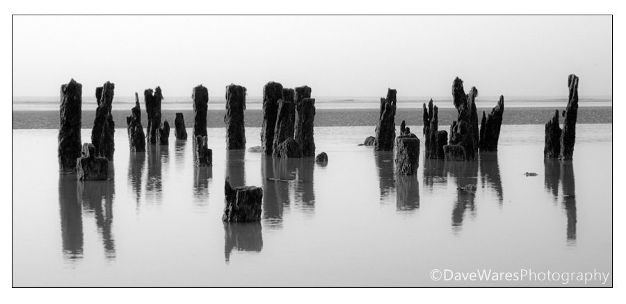
Not every scene will benefit from being presented in monochrome and in a lot of cases a picture can become too cluttered with the viewer not being a clear indication of where to look. So it’s time to train your brain into seeing in black and white even though we see in colour. The key to achieving a more successful mono image is to simply view the scene in terms of shape and contrast. It’s the same compositional idea that drives all photography and knowledge of basic composition ideas will give you a big head start. Look for bold objects such as a large boulder in the countryside or a fence that you can use to lead the viewer through the scene, or look for things that are in contrast to their surroundings. Lets take the image above as an example; the wood posts are virtually in silhouette against the overcast sky and bright water, so by placing the camera where I could see them arranged in a line I produced a simple yet striking composition, and with the sky being mostly overcast there was very little in terms of colour so the obvious thing was to remove it. Read More→