Archive for app

OSXcellence – NIR Color

White trees and black skies – enter the world of warped color, known as infra-red photography. In recent years, the rise of affordable DSLRs has enabled photographers to put “last year’s model” aside for conversion to infra-red, and, as a result, infra-red has seen somewhat of a renaissance, particularly with landscape photographers looking for a way to make their pictures different. As with other forms of in-camera stylistics, infra-red is a look which a number of app publishers have tried to copy, but most have found that a realistic infra-red look is almost impossible to achieve. Can NIR Color, by JixiPix, provide a better experience?

The first thing I must say before looking at NIR in any depth is this – IR imaging is not truly replicable with a computer. Software can guess how colors would have appeared if taken in infra-red, but a true reflection of a scene as pictured in infra-red is impossible.

With this in mind, it is not surprising that NIR’s color-shifting filters don’t make an image look like it was taken in IR. But then again, JixiPix haven’t really attempted to make an IR emulator. The clue is in the name – it is called NIR Color, not IR Color.

Read More→

OSXcellence – Waffle Review

The Romans had amazing floors, didn’t they? I am, of course, talking about their mosaics – amazing arrays of tiny tiles, which, when looked at from a standing height, formed stunning images and designs. The principle of many tiles making an image is the same principle which digital images use today, with the difference being that the tiles are replaced by pixels. Considering this similarity, it is hardly any wonder there are so many digital mosaic apps available, usually allowing you to create a mosaic from images in your library. Waffle, by Square Candy, is a minimalist example of this, but is it the equivalent of those exquisite Roman tiles, or does it produce something closer to concrete slabs?

Waffle isn’t really about bells and whistles – this really is a pared-down app. You choose the picture to be recreated in mosaic form, and select the images to be used as the “tiles.” You then have two options as to what kind of “tiles” to use. The asymmetric option asks you to choose a minimum and maximum tile size, and then Waffle will use larger tiles on areas of a similar colour, and smaller tiles where detail is needed. I found that this worked okay when your mosaic base image was quite large, but if you use a smallish image (under 1000×1000 pixels, for example), the results from this option start to become unusable. Admittedly, when the asymmetric option works well, it looks funky, but it’s a hit-and-miss affair. The other option available, symmetric, simply allows you to select an exact tile size, and, in general, it works far better, even if it lacks the quirkiness of the asymmetric look.

Read More→

OSXcellence – Picturesque

As keen photographers, when we present our images on paper, we will often spend a lot of time (and money) on making the presentation of our images beautiful. The same care is often not taken when we publish images online. Perhaps this is as a result of the unlimited nature of the internet, as well as the speed at which it operates. Whatever the reason, perhaps we should start taking a little more care, not least because more and more, we view images on-screen – a trend which isn’t likely to reverse any time soon.

Acqualia, the makers of the popular Mac spreadsheet/calculator hybrid Soulver, have created their own app for streamlining the process of digital image presentation – Picturesque. But are you better off sticking with Photoshop?

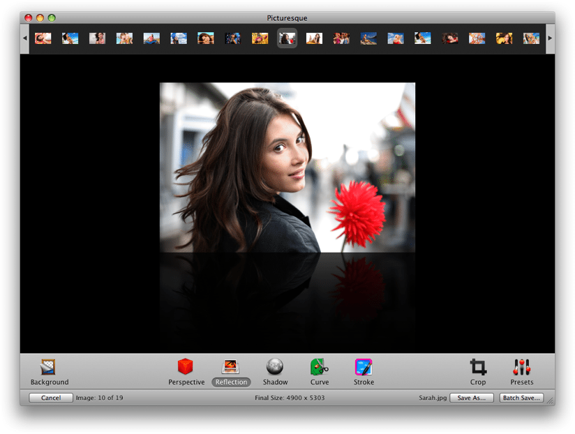
The idea of Picturesque is to make the process of creating reflections, shadows and rounded corners straight-forward. Drop your image into the app, and almost instantly, you’re ready to edit within Picturesque’s smooth, clean interface. There are, essentially, 5 different options: perspective, reflection, shadow, corners and stroke.

The perspective tool allows you to position your image at a 3D angle, as if rotating a piece of paper in space. The usefulness of this feature? Well its use isn’t exactly obvious……shall we move on?

The reflection tool allows you to apply an iTunes coverflow-style reflection below your image, and I can imagine this being quite useful for creating a certain look on websites, although generally speaking, this isn’t of great use to photographers. If you do want a reflection, however, Picturesque provides you with customisation options (length, opacity, offset) whilst also retaining rapid use, and the finished product is very much one of quality.

Read More→

WordFoto: Your Photos + Stylized Text = Awesomeness!

When you review IOS apps you tend to experience a sense of deja vu in that so much of what you see has already been done, and done, and done… So finding new and exciting apps to share with the Current Photographer readers becomes progressively more difficult as time goes on, and so much of what I see is just a different twist on something that has already been done–and sometimes overdone. After all, my goal in writing these reviews is to share with readers apps that I actually use. And frankly, I don’t use seventeen apps that do the same thing. I select my favorite and use it.

WordFoto is not the first app of its kind that I saw. There are others out there, but I was not satisfied with them enough to actually use them for my own photos. But finding another such app ultimately led me to WordFoto.

WordFoto allows you to take or select a photo, add one or more words, and it works its magic by combining the words and photos in an attractive format. Here is a photo that I took in the app while writing this article. Yes, I stopped just now and took it, cropped it within the app, and uploaded it to Dropbox from my iPhone 4. Then I went into the “Words” menu in WordFoto and added a new word set that contains the words, “Zeke”, “cat”, and “meow”. I selected that set then went to the “Style” menu. For this photo I selected “Classic Color” and it is ready to export to the camera roll. Read More→

OSXcellence – Darktable Review

The photo library genre of app is stronger now than it has ever been, with Adobe and Apple adding more and more features to their respective flagship software, Lightroom and Aperture. So all-singing and all-dancing are these heavyweights, that many editing apps have been made redundant, their features being replicated and integrated into these mammoth photo organisers. But with this increase in functionality comes an increase in price; what if you want something that will process your RAW files and allow you to organise your pictures, without having to take out a mortgage to afford it? Perhaps you should look at darktable.

Despite being an open source project, darktable looks the business. The interface is sort of….well, dark really. It also happens to be clear and highly usable. But how darktable looks is very much a by-the-by, because the real interest here is the amazingly powerful array of organisation and editing tools.

Once you’ve imported your images to darktable, you are presented with a bewildering number of organisation options; from keywords, to collections, to image exposure comparison, there shouldn’t be a time when you can’t find the image you’re after. All the standard organisation functions found in more expensive offerings are present and correct, though, like star ratings and colour labelling, and I have to say, all of these functions work incredibly smoothly and rapidly.

Read More→

OSXcellence – LightFrame Review

Great images will always be pleasing on the eye, but the overall impression a viewer will get is dependant on how that image is presented. This includes factors such as whether the image is digital or on paper, editing quality, but also framing. Whilst you can just go out and buy a frame for printed pictures, digital images need the help of some software to make them stand out. LightFrame uses OSX’s in-built textures to superimpose digital frames around your pictures, but is it a presentation improver or degrader?

The first thing I noticed about LightFrame is how dodgy the viewing controls are. I tried to zoom in and out of the picture, but just ended up with a semi-zoomed-in view which was heavily distorted – not a good start. Loading up the tools in LightFrame is easy enough (assuming you guess that the “scenes” button opens up the tool palette), as is the process of using the tools themselves. Alongside the framing options, LightFrame has a number of other features, such as the ability to add a caption or sprite to the image, plus image cropping and resizing.

The textured frames in LightFrame are terrible, looking like something grabbed from a gaudy mid-90s web page. On the plus side, the plain colour frames look okay, and LightFrame’s in-built shadow creator is pretty nifty, allowing you to select the angle of light. In addition, LightFrame can create borderless frames (like the clip ones); that is, it can create the shiny effect of its real-life counterpart.

The rest of the functions in LightFrame work well enough, although the list of apps out there that will perform the exact same functions (many being free, I should add) is the size of several directories. It is also worth noting that many of LightFrame’s rivals work a great deal better. Read More→