Archive for Lightroom

Scenic Outlook – 3 Easy Ways to Not Look Like an Amateur

Amateur (noun) – a person inexperienced or unskilled in a particular activity

I think we can all agree that the definition of amateur doesn’t exactly have the nicest ring to it. A lot of photographers out there do fit this description, which is perfectly fine or everyone with a camera would be doing this for a living. The trick is not letting other people know it. There are difficult methods for your images to look like a pro’s but also very easy ways to NOT look like an amateur. I have seen countless photographs of beautiful sweeping landscapes and majestic sunsets only to be ruined by the simplest (read: careless) mistake. The three things I am about to cover are major pet peeves of mine that will instantly drop an image from the ranks of great to mediocre. My goal is to have you think the same thing by the end of this article. Remember, our work doesn’t have to stand up to the likes of Ansel Adams, but it does have to be better than that guy snapping away with a disposable camera. These tips are easy and you CAN do this.

Straight horizons

Number one. Numero uno. The be all end all. I can probably go on for days how crucially important this is but I will spare you the diatribe. Just repeat after me: I will make sure my horizons are straight. Very good, you are already on the non-amateur path. My advice is simple; take your time composing and framing your shot. There is a simple approach I take every single time I compose a landscape image to make sure my horizon is straight. Get this right in camera and you won’t have to straighten and crop part of your scene later. If you are using a DSLR, place it in live view mode once it is secured to your tripod and enable grid lines if they aren’t already. Take your time adjusting the angle of the camera until the lines show a perfectly straight horizon. Remain in or cancel out of live view and snap your shot.
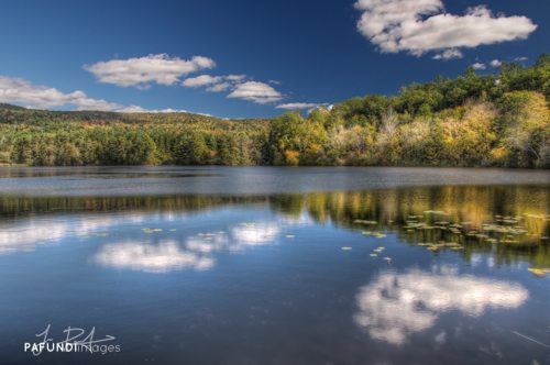
It was imperative that my horizon was straight for this image given that I was playing off of symmetrical reflections.

Dead center is dead boring

Being that we are already on the topic of straight horizons, lets keep the mojo going with another absolutely crucial non-amateurish tip: avoid centering your (now) perfectly straight horizon. Don’t get me wrong, there are times when a centered horizon will work, but for the most part that isn’t the case. When there is equal space above and below a horizon line, your eye wanders looking for a place to focus on in the frame. Our eyes are followers and need to be told visually where to go. As a general rule of thumb, if you want to emphasize a really dramatic sky, lower your horizon. If the foreground is the main point of interest and you are faced with a so-so sky, raise the horizon to the upper third portion of the frame.

The only reason this image works and has any impact is because the sky is dominating the frame. Your eye is led by the reflection in the water, to the sun, then traverses around the dramatic sky.

Dust it off

Step 3 in the non-amateur program: dirty sensors. It happens to the best of us. Well, actually, it happens to all of us. Sensor dust is part of the game whenever you are changing lenses and for the most part, it’s unavoidable. Dust spots will be the most present in the under exposed areas of your image, but they are easily abolished. The first thing I do when processing a photograph is look for dust spots. Sometimes I will spend 5-10 minutes making sure I took care of every single one because to me, a single blemish can ruin a photograph. Inspect your shot from every viewing angle on your monitor. Some spots are only visible from the sides or straight on. Then use content aware fill or a healing brush to rid your image of those nasty specks.

In order to maintain all the detail in the sky and silhouette the distant boats, I under exposed this shot. With that, dust spots were present throughout.

Congratulations! You have now completed the 3 step program. With some simple care and attention to detail, you can avoid the amateur tag and start taking your work to the next level.


–

Jesse PafundiJesse Pafundi is a photographer hailing from Long Island, New York. A lover of all things photography, he enjoys traveling and capturing the world around him as much as possible. In addition to shooting landscapes, he has a major affection for New York City architecture and urban exploration. Whether it’s HDR, lens filters, or iPhoneography, he enjoys dabbling in and learning as many techniques as he can consume. Jesse believes strongly in the use of social media and blogging as a tool to further his knowledge and share his passion with anyone who wants to listen.

Photo Credit: © Jesse Pafundi

Here’s how you can share your tips, techniques and tutorials on CurrentPhotographer.com


OSXcellence – Darktable Review

The photo library genre of app is stronger now than it has ever been, with Adobe and Apple adding more and more features to their respective flagship software, Lightroom and Aperture. So all-singing and all-dancing are these heavyweights, that many editing apps have been made redundant, their features being replicated and integrated into these mammoth photo organisers. But with this increase in functionality comes an increase in price; what if you want something that will process your RAW files and allow you to organise your pictures, without having to take out a mortgage to afford it? Perhaps you should look at darktable.

Despite being an open source project, darktable looks the business. The interface is sort of….well, dark really. It also happens to be clear and highly usable. But how darktable looks is very much a by-the-by, because the real interest here is the amazingly powerful array of organisation and editing tools.

Once you’ve imported your images to darktable, you are presented with a bewildering number of organisation options; from keywords, to collections, to image exposure comparison, there shouldn’t be a time when you can’t find the image you’re after. All the standard organisation functions found in more expensive offerings are present and correct, though, like star ratings and colour labelling, and I have to say, all of these functions work incredibly smoothly and rapidly.

Read More→

A Brush of Warmth – Behind My Eyes

One of the latest additions to the last revisions of Lightroom and Aperture is somewhat of a game changer in my book, and that’s the ability to apply a white balance setting selectively. Being an Aperture user, I have not experienced how the Lightroom option works, but based on the many discussions and posts people made when version 4 came out, I’m guessing it’s quite good.

The latest update to Aperture included a few new options for white balance, such as three types pertaining to how you’d like for the temperature of a picture to be adjusted: Natural Gray (new), Skin Tone (new) and Temperature and Tint (previous standard). The two new additions allow you to use a brush to selectively apply the effect.

For most folks, the big reason for using this new tool is when you have competing light sources within the same picture, like having both incandescent and natural window light in the same image. You can shoot for one and apply the other in post, evening out the image. My first experience, however, was from more of a creative need. Let me show you.

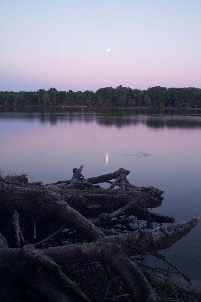
The image below is an 8 second long exposure taken at the Mississippi River in St. Paul Park, MN. That’s the Blue Moon in the sky reflecting off of the river and some rather interesting tree roots sticking out from the bank. There were two things in the image I wanted to make standout, the great blue and magenta tones in the sky (and watert) and the gnarly roots on the bank. I started with the sky colors.

Original Image – f18, ISO100, 8s, 19mm

Read More→

OSXcellence – Snap Art 3 Review

Since the dawn of time – well, of Photoshop, anyway – photographers have taken pictures, loaded them into their photo editor, and then seen the tempting “art” filters, only to be disappointed by them time and time again. As a result, what should be a good idea – artifying photographs – has been a technique to avoid at all costs. Alien Skin’s Snap Art 3 is a plug-in for Photoshop, Elements and Lightroom, which attempts to deliver a better in-computer art experience to photographers. But is it a Caravaggio, or more of a crayon?

Snap Art 3 is accessed via the filters menu, but upon activation, it springs up in a new window of its own. Unlike Photoshop’s built-in art filters, Snap Art 3 comes with a plethora of realistic options. First, you choose your favoured real-world method of putting an image on canvas. Options include pastels, watercolours and pen and ink. Each style has its own set of variables, such as paint thickness, brush stroke length and brush size. The results are very realistic and, to add a unique twist to every picture, Snap Art 3 includes a 4-digit randomisation system, which means the texture of the “canvas” can be one of 9,999 subtle variations.

Once you’ve chosen your style, you then have the option to adjust it selectively, using Snap Art 3’s in-built layer mask system. Unfortunately, this does not include adjustments such as colour or exposure, but it does allow you to change photorealism and brush effects on an area of the image, perhaps increasing the apparent realism of the artwork. Snap Art 3 does, however, include the ability to make standard adjustments to the whole artwork.

Read More→

OSXcellence – PhotoSweeper Review

I don’t know about you, but I often come back from photoshoots with a bucketload of pictures, which all need sorting through. And whilst the reams of metadata which Aperture would like you to fill in can be useful for re-finding pictures at a later date, sometimes you just want to sort your pictures in a simple but fast manner. This is the idea of PhotoSweeper – a lightweight image sorter.

The primary function of PhotoSweeper is the weeding-out of unwanted photos. The first step with PhotoSweeper is to select a folder, or library – of the Lightroom, iPhoto or Aperture variety – to sort through. PhotoSweeper rapidly loads previews of your images, and you’re ready to start sifting through the pictures.

The best function in PhotoSweeper is the duplication detection. A number of variables can be adjusted to locate duplicates, such as time between pictures or the size of the bitmaps sample (the area compared for similarities in each picture). In addition, you can define whether to compare in RGB or greyscale, whether to preprocess images with blur, and how sensitive you want the colour-matching to be. How closely images must match is also adjustable. Once the (potential) duplicates are found, you can view the sets of matching images either individually as a side-by-side comparison, or as a list, which includes all of the sets of duplicates. It is a system which allows very rapid ridding of duplicates to the “Box” – PhotoSweeper’s in-app temporary trash. From the “Box,” images may be deleted to the OSX Trash.

In addition to the duplicate search function, PhotoSweeper has a speedy file info function. By clicking on an image, you can view useful EXIF info such as the histogram, focal length and exposure settings. Other more mainstream apps have this feature, but none of them do it as quickly as PhotoSweeper. Read More→

To HDR, or Not To HDR – Behind My Eyes

The brief bio below for yours truly tells of HDR (High Dynamic Range) being my first love of photography. That will never change – the creative and artistic flexibility of the process allows a part of my brain that was fairly dormant for years to pop out now and then and say hello. There are also a few instances where HDR just works better (in my humble opinion) than any other processing method, like extreme contrasts in light and bringing out textures. At one time, every time the camera was pointed at something, brackets were collected and run through the tone mapping process, without much thought or consideration – it’s just what I did.

As time has moved on, I find myself moving out of the auto bracketing mode on the camera more often, and even choosing to process a single image out of a bracket set rather than processing all of them through the HDR software. This is likely a natural progression for HDR photographers. Maybe there’s some boredom involved or wanting to save some time, but there’s also other processes out there that I’m finding interesting and fun that produce some pretty cool results. Let’s take a look at an image and go through how the stuff behind my eyes is processing things these days.

Middle Bracket 0 EV

Take this image above. It’s the middle shot of a bracketed set of 5, ranging from -2 EV to +2 EV at 1 EV increments (this image is 0 EV). It was taken back in February 2010 and is a monument devoted to the Confederate dead buried in the historic Oakland Cemetery in Atlanta, GA. Back in 2010, this set was immediately run through Photomatix and tone mapped. Looking at the stack now, my preferences have changed – here’s why. Read More→