Archive for Make Better Photographs – Page 2

Senior Guys Need Pictures Too!

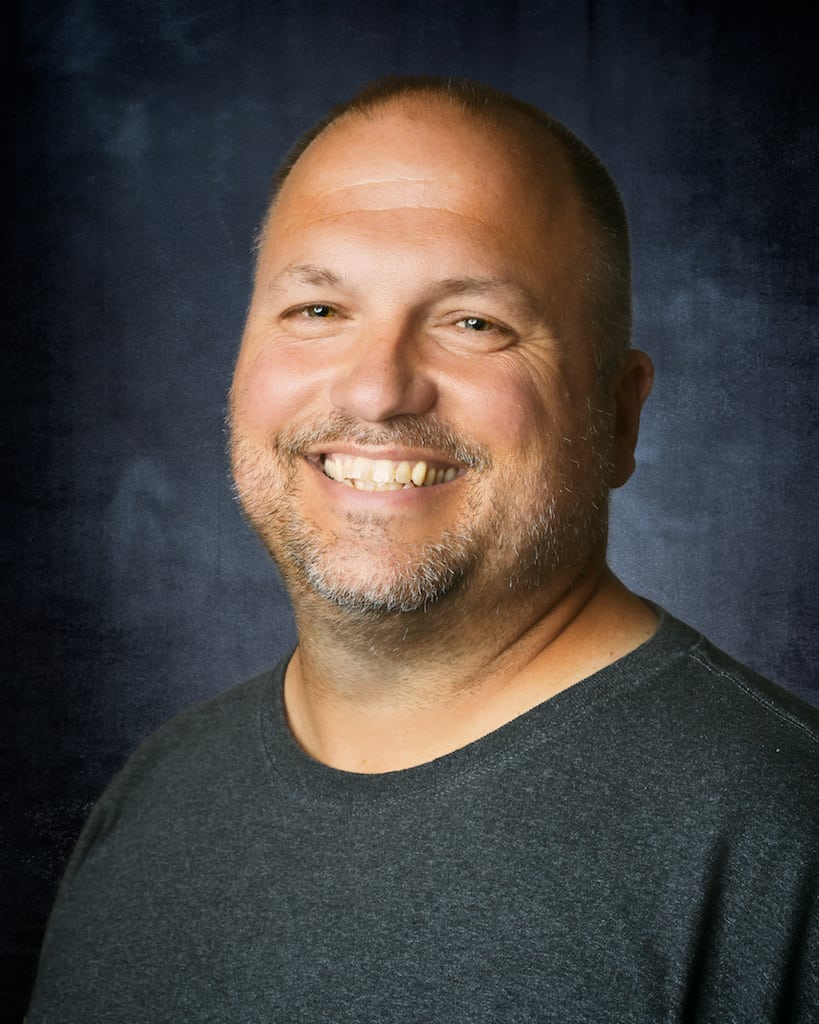
There seems to always be an area of interest and confusion surrounding photographing guys for senior pictures. We get asked often if we do photograph guys and is it harder or easier to photograph guys or girls for their senior pictures. I have even gotten a lot of emails recently from other photographers asking what do to with guys….”I mean they just kinda stand there”. Senior guys are unique just like senior girls. When we started concentrating on senior photography a few years back I think we had one senior guy. The next year it doubled to two, and the next…4. Until this year we had more than a dozen senior guys. In this article I want to talk about some myths surrounding photographing guys for their senior pictures and what works and doesn’t work when shooting guys.

One might assume that most guys don’t won’t their picture taken and they are only here because their mom dragged them here. I made this mistake early on with senior guys. I assumed Mom was the reason they were here and all our questions about the shoot were directed towards Mom. Big mistake. I have never met a senior girl that wants to look short and large on camera and  I have never met a senior guy that doesn’t want to look good in his pictures. Now they aren’t necessarily going to admit this to you or anyone else but it is your job to recognize this. One of the keys to success with senior guys is to talk to them. If they can’t tell you what they do like get them to talk about what they don’t like. I often ask them to finish the statement “I don’t won’t to look (fill in any adjective) in my pictures. I get a HUGE variety of answers but I believe that recognizing and validating any concerns is a big initial step. Sometimes the goals for the shoot may simply be to NOT look a certain way. And that is fine too. I often joke with them that we want most of the pictures to look like Ben Stiller’s character in the movie Zoolander.

With some guys I think one of the ways to have a successful shoot is to continue to stress how “easy” the shoot is gonna be. I stress that I like shoots with the guys to be about just “hanging around” and “getting a few shots”. I try to ease the “dread” right up front. I don’t want to over plan and try to complicate things to much. A lot of times I see senior guy photography with too many props. “Props” are important but I think they are used too much by photographers who are uncomfortable with senior guys or who have run out of ideas with senior guys. In other words, it doesn’t always work to take a senior guy, prop him up against his car, have him wearing his letterman jacket while holding a football in one hand, a baseball in the other, and an acoustic guitar on the hood, while wearing sunglasses and parked in front of his school with his dog standing beside him. Too much equals not easy!

But it is important to explore the interests and activities of the senior guy. We try and narrow it down to what is important to them and their family or what activity sums up the last 12 years of their life. Obvious answers are sports, hunting, and music. But it is your job as a professional to capture these in a way that is unique to the senior. Not to get the stock shot of them holding the baseball bat behind their head while you tilt the camera. I like to bring along some tennis shoes on my shoots. I brag about still being an athlete but I love to shoot a little basketball or try and race one of our seniors. Spend the extra time to loosen everyone up on the shoot. Don’t just try to rush the shoot because he is a “guy” and “doesn’t want to be here anyway”. Explore different locations along with different angles, lenses, lighting, etc.

It is true that makeup and hair may not be as big a deal with your guy seniors as with your girls. But their looks are important and posing is a major part of this. Posing is probably the biggest concern for senior guys and for their photographers. For me I like all of our seniors to look tall and confident in their pictures. For guys make sure you are conveying this in your photos. I want guys to look relaxed but confident and a lot of times you can achieve this just by having them place their hands in their pockets. Even for great headshots this works because it relaxes the senior and makes them feel more comfortable. I try and avoid sitting guys down for a full body shot. I think it makes them look weak and not as powerful as standing or leaning. Also look for strong textures and dark colored backgrounds. Finally, not EVERY single picture has to be smiling. Not that the senior guy has to have this tough, macho, angry, look on his face but you can convey assuredness and confidence without a big happy smile every time. Remember these are not rules, they are suggestions and what works for us. It is always important to learn the rules…then break them.

If you want to be successful with shooting senior guys, the senior has to like the images…not just mom and dad. The senior guys are the ones you want to make happy and proud of the work so that they are confident enough to show it off as well. Make sure you specifically show and blog images that the senior can be proud of and images that will draw interest to your studio.


Tips To Improve Your Grunge Photography

If you want to improve your grunge photography, allow these simple tips and tricks to help you find interesting subjects, compose your shots, and if nothing else, inspire you.  I have assembled some of my best tips and tricks that can be used not only for grunge photography, but other photographic styles as well.

The End Of The Road

Take The Road Less Traveled

Instead of traveling the same road that everyone else travels, make your own way. Most of the abandoned and grunge photos I have taken are the direct result of taking back roads, and avoiding highways. Every small town will always have at least one ghost road, at least one abandoned building, and generally a handful of friendly people who will be more than happy to suggest places that a photographer might be interested in. When in doubt, ask someone who lives or works in the area; those with a lot of local knowledge will be most helpful.

This photo was found at the end of a dirt road. It is also important to geotag your photos, especially if you add them to Flickr so that others can see where the photo was taken (more on this later).

The Life They Let Slip Away (Holga Edit)

Don’t Overlook The Details

Or as they say, the proof is in the pudding. Instead of just taking photos of grand places, shoot the details. While I was exploring an abandoned house, I came across a room filled with trash and neglected toys. Just as I was about to leave, I came across this old doll laying on the floor behind an open door. After taking several shots of this doll, this one was by far my best shot of the day, and perhaps one of my most talked about and coveted photos.

Empty House 1 - 1

Do Your Research

In other words, know before you go. I originally planned to visit the abandoned town of Centralia, Pennsylvania. After talking to some local folks, I was referred to Ashland instead, which was a neighboring town with lots of abandoned places. I came across this abandoned house; it looked small from the front, but looks can sometimes be deceiving. It ended up being a multi-family dwelling with some sort of car repair shop in the back.

Old Phone

Trash Can Be Pretty

The mark of a good photographer is the ability to take a picture of something nobody cares about, might find uninteresting or is just plain unattractive, and turn it into a priceless shot. One of the best groups on Flickr is called clutter, litter, mess and muddle.  I found this old telephone on top of a pile of discarded trash.  The fact that it was raining at the time the shot was taken added to the mood and made the lighting even more interesting.

Roller Skates

Look For Patterns

I decided to spend some time at a skating rink following a birthday party I was photographing.  At closing  time, I watched about 100 people drop their skates in front of the skate rental counter.  I took this picture as the staff went around picking up the pairs of skates one by one as they were put back on the shelves.

Geotag Your Photos

Flickr has an amazing mapping feature that I believe is not used nearly enough.  If you go to the Map Page on Flickr, you will be shown an interactive map of where photos were taken.  Not only is this a great way to view new and interesting places and photographs, but it can also be a useful tool to research places to take photos. Above all else, one of the best ways to share your grunge photography and/or urban exploration photos is to disclose the location where it was taken.  I try to geotag the photos I take whenever possible, except sometimes when the location needs to remain undisclosed to protect the property or to protect myself from possible litigation by the property owners, be it current and/or future.

Here are a handful of related Flickr groups worth a look:

I should probably also mention this guys blog… Jacques has a fascinating collection of urban exploration photograpy, and his blog is entertaining, inspiring, and resourceful.

Black and White Toning in Lightroom – Behind My Eyes

When color does not add to the story, remove it. This is a rule I work with in editing my images and some images, even when seeing them without the camera, you know are going to be black and white. However, just because an image is converted to black and white doesn’t mean color toning can’t be used. Almost every black and white image I make will take on either a warm or cold tone depending on the mood I want the image to take on.

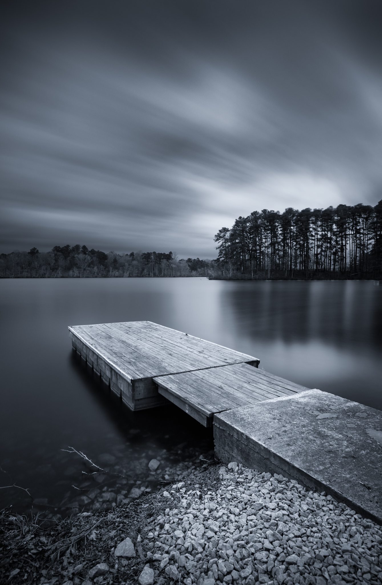
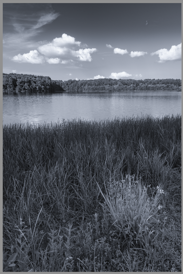
Cold toning of a black and white image

One of the things Lightroom drops the ball on, in my opinion, is black and white conversion. It’s just never produced the image I envisioned when converted there. As result, almost every black and white image I produce has been converted with NIK Silver Efex Pro 2 or using a gradient map in Photoshop. As poor as the black and white conversion in Lightroom is, toning the image after conversion is incredibly easy and efficient in Lightroom, and I use it nearly every time – and that’s where we’re going to go today!

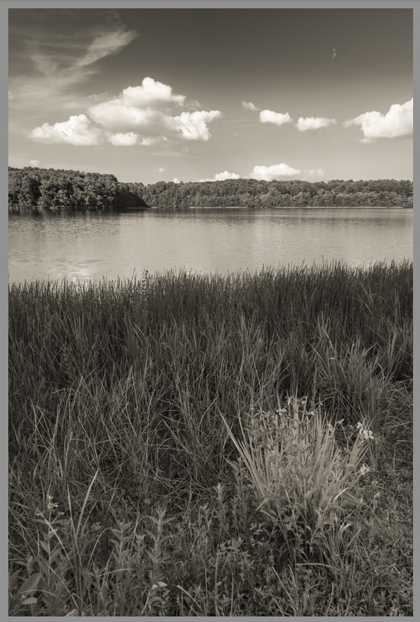
Warm toning of a black and white image

DISCLAIMER

Two things to get out there before we move one. First, I LOVE the VSCO film presets in Lightroom and use them almost exclusively for portraits, color or black and white. It’s really the only time my images are converted to black and white in Lightroom directly. Second, The statements made both previously and later in the article about the Lightroom black and white conversion are based solely on my preference – if you like converting there, go for it! This is not a rule as much as a possible tool set that may help you in toning your images quickly and effectively.

With that said, this method of toning can’t be used in the same manner when conversion is performed in Lightroom, that is unless the image is externally edited afterwards. There are other options prior to exporting and we’ll mention them as we go!

THE TEMPERATURE SLIDER

Ok, so, there’s nothing new about using the temperature slider in Lightroom – it’s a very useful tool in color balance and creative editing, however, it is my GO-TO slider for black and white toning! Let’s look at how it works.

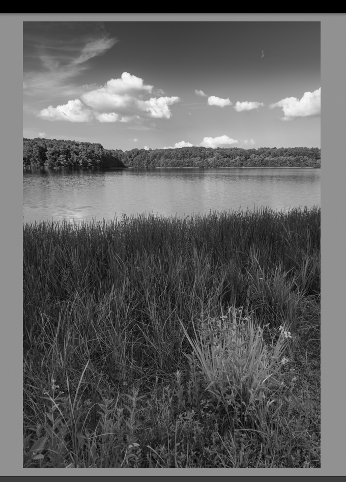
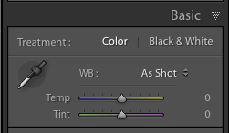
The image below was converted to black and white and edited for selective exposure, contrast and structure in Silver Efex Pro 2, then saved back into Lightroom. It looks good from a tonal balance, light to dark, but let’s say we want to add a cooler tone to the overall. Being that we converted outside of Lightroom, the temperature slider now will apply temperature tones, cold or warm, on top of the image. You can find the temperature slider in the BASIC portion of the Development module.

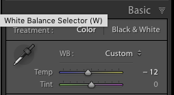
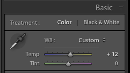
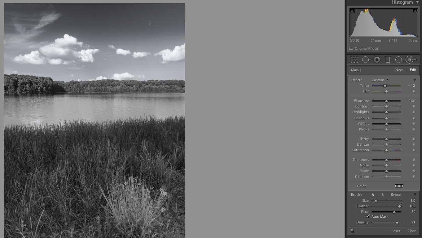
To add a cooler tone to the image, simply drag the slider to the left, towards the blue part of the slider, until you obtain the desired cooler tone. A -12 setting gives a nice cooler tone without changing everything to blue – see the image below.

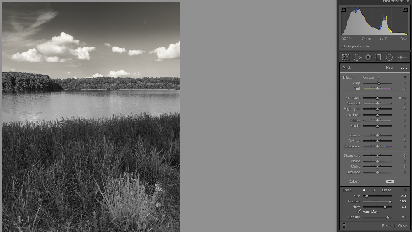
Let’s say you would prefer the warmer tones instead. It’s as simple as dragging the slider to the right, towards the yellow color of the slider. See the opposite effect below. As you can see, the warmer image yields a more sepia-like tone.


It’s that simple and pretty much how I tone every black and white image I make! But you might be asking, “What if I want to selectively apply a tone to the image?” Well, that’s pretty easy as well, all you need to do is use the brush tool!

Let’s say we just want to apply a tone to the sky in this image. Click on the brush tool, which is located just above the Basic panel in the Development module – see below.

Brush Tool

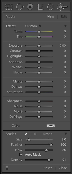
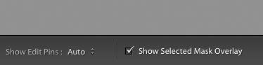
Once you click the brush tool, the above menu opens up. Be sure to double click on ‘Effect:’ to reset all of the sliders in the tool to zero. Then use the brush and drag over the portion of the image you’re wanting to apply the effect to, in this case, the sky. While using the brush tool, you can see a check box in the bottom left hand corner of the interface that says “Show Selected Mask Overlay’ to see where the brush is applying the mask.

Masked area

If there is part of the mask on an area you don’t want apply, on the brush menu, click ‘Erase’, adjust the brush size and drag over the area you want to remove the mask from. Once done, click the ‘A’ so that you can continue applying the mask.

Once you’ve set the area to mask, simply go back to the temperature slider and drag to the desired temperature just as you did before. Once you’ve got your tone, click close. This can be repeated as many times as you like with selective tones applied all over the image!

Sky is converted to a cooler tone


Sky converted to a warmer tone

SPLIT TONING

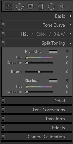
There is another option to applying these tones, and other tones, to your black and white image through the Split-Toning menu in Lightroom. It’s not as selective as you have to apply the tones specifically to highlights and/or shadows and there is no way to brush these tones in, but it can work. It has been used on occasion, but seldom, as I typically prefer simply cooler or warmer tones overall or selectively applied.

TEMPERATURE SLIDER WITH LIGHTROOM B&W CONVERSION

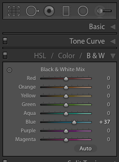
As stated in the disclaimer earlier, if an image is converted to black and white in Lightroom, the temperature slider does not work in the same manner. It has a similar impact as the color B&W adjustments do. The file still knows where the colors are in the image and when converting to black and white, it applies that tone to a similar tone of gray. Let’s say you slide the blue Black & White Mix slider to the right (see pic below), the spots in the image that used to be blue increase in brightness. Sliding it to the left would then darken those tones.

This same thing happens when you slide the temperature slider after black and white conversion in Lightroom. Sliding it to the right, or the warmer color tones, will brighten those undertones of gray. Sliding to the left, or the cooler tones, brightens those tones only. No color tones are applied on top of the black and white conversion, but their gray undertones are adjusted, so you’re not adding a tone as much as adjusting a current one. This is a much different result.

CONCLUSION

No one tool is useful to everyone. Painters like different brushes, paints, canvases, etc. Plumbers use different wrenches, sealants, brands of plumbing fixtures. Each tool fits each artist in a different way, so some work and some don’t. This method of toning a black and white image is one that works for me – it’s quick and impactful, but it does not work if converting to black and white in Lightroom, so it may not be your cup of tea. That’s OK. You may prefer to do your toning in Photoshop, or directly in Silver Efex Pro 2, or (insert plug in here) and that’s OK, too. But you may also find this method as useful as I do, and that’s cool as it makes sharing this info helpful. Just keep in mind, the overall objective is to find the tool, or tools, that works best to produce the image that exists right Behind Your Eyes!


Scenic Outlook – 3 Easy Ways to Not Look Like an Amateur

Amateur (noun) – a person inexperienced or unskilled in a particular activity

I think we can all agree that the definition of amateur doesn’t exactly have the nicest ring to it. A lot of photographers out there do fit this description, which is perfectly fine or everyone with a camera would be doing this for a living. The trick is not letting other people know it. There are difficult methods for your images to look like a pro’s but also very easy ways to NOT look like an amateur. I have seen countless photographs of beautiful sweeping landscapes and majestic sunsets only to be ruined by the simplest (read: careless) mistake. The three things I am about to cover are major pet peeves of mine that will instantly drop an image from the ranks of great to mediocre. My goal is to have you think the same thing by the end of this article. Remember, our work doesn’t have to stand up to the likes of Ansel Adams, but it does have to be better than that guy snapping away with a disposable camera. These tips are easy and you CAN do this.

Straight horizons

Number one. Numero uno. The be all end all. I can probably go on for days how crucially important this is but I will spare you the diatribe. Just repeat after me: I will make sure my horizons are straight. Very good, you are already on the non-amateur path. My advice is simple; take your time composing and framing your shot. There is a simple approach I take every single time I compose a landscape image to make sure my horizon is straight. Get this right in camera and you won’t have to straighten and crop part of your scene later. If you are using a DSLR, place it in live view mode once it is secured to your tripod and enable grid lines if they aren’t already. Take your time adjusting the angle of the camera until the lines show a perfectly straight horizon. Remain in or cancel out of live view and snap your shot.

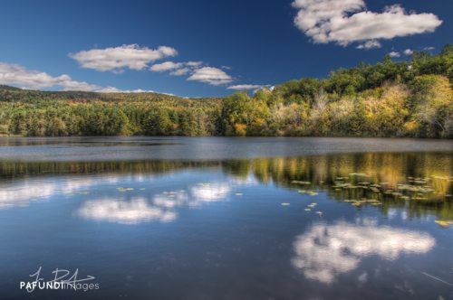
It was imperative that my horizon was straight for this image given that I was playing off of symmetrical reflections.

Dead center is dead boring

Being that we are already on the topic of straight horizons, lets keep the mojo going with another absolutely crucial non-amateurish tip: avoid centering your (now) perfectly straight horizon. Don’t get me wrong, there are times when a centered horizon will work, but for the most part that isn’t the case. When there is equal space above and below a horizon line, your eye wanders looking for a place to focus on in the frame. Our eyes are followers and need to be told visually where to go. As a general rule of thumb, if you want to emphasize a really dramatic sky, lower your horizon. If the foreground is the main point of interest and you are faced with a so-so sky, raise the horizon to the upper third portion of the frame.

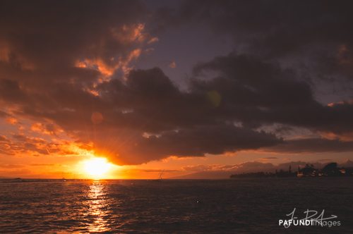
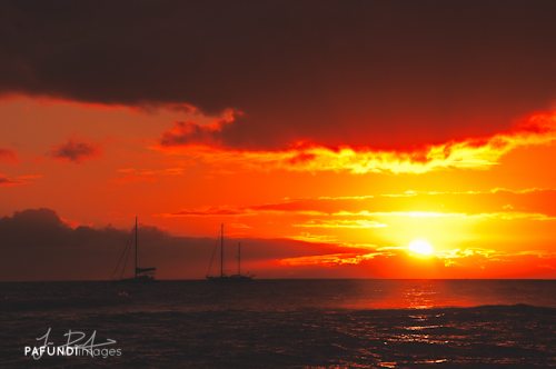
The only reason this image works and has any impact is because the sky is dominating the frame. Your eye is led by the reflection in the water, to the sun, then traverses around the dramatic sky.

Dust it off

Step 3 in the non-amateur program: dirty sensors. It happens to the best of us. Well, actually, it happens to all of us. Sensor dust is part of the game whenever you are changing lenses and for the most part, it’s unavoidable. Dust spots will be the most present in the under exposed areas of your image, but they are easily abolished. The first thing I do when processing a photograph is look for dust spots. Sometimes I will spend 5-10 minutes making sure I took care of every single one because to me, a single blemish can ruin a photograph. Inspect your shot from every viewing angle on your monitor. Some spots are only visible from the sides or straight on. Then use content aware fill or a healing brush to rid your image of those nasty specks.

In order to maintain all the detail in the sky and silhouette the distant boats, I under exposed this shot. With that, dust spots were present throughout.

Congratulations! You have now completed the 3 step program. With some simple care and attention to detail, you can avoid the amateur tag and start taking your work to the next level.


–

Jesse PafundiJesse Pafundi is a photographer hailing from Long Island, New York. A lover of all things photography, he enjoys traveling and capturing the world around him as much as possible. In addition to shooting landscapes, he has a major affection for New York City architecture and urban exploration. Whether it’s HDR, lens filters, or iPhoneography, he enjoys dabbling in and learning as many techniques as he can consume. Jesse believes strongly in the use of social media and blogging as a tool to further his knowledge and share his passion with anyone who wants to listen.

Photo Credit: © Jesse Pafundi

Here’s how you can share your tips, techniques and tutorials on CurrentPhotographer.com


Secrets of Lo-Fi Photography

between an erupting earth and an exploding sky
Between An Erupting Earth And An Exploding Sky by Ashley Buress, Used With Permission.

Lo-fi photography is a style of photography generally using poor equipment, such as toy cameras or pinhole cameras, for stylistic effect. It is often considered a reaction to the perceived ease of creating technically perfect photos in the digital age. Generally the emphasis is on using film, rather than digital technology.
–Wikipedia

The LaundromatPop CornSave-A-LotUnleaded $3.239

Recently, I learned an important lesson about photography.  The camera does not make the photograph, the photographer does.  This concept has been intentionally dismissed by camera companies who insist that you need the latest, most high-tech, and expensive camera gear to create beautiful images.  Recently some photographers have become late adopters to the idea that beautiful images can be created with outdated and sub-standard camera gear.  Sadly, with the era of digital photography, film cameras are now slowly being considered lo-fi, as are Polaroid instant print cameras.

Perhaps the most notable lo-fi cameras include Dianas, Holgas, Lomos, and as far as digital is concerned, very low megapixel digital cameras.  The featured image at the very beginning of this article was provided for use by Ashley Buress, whose Flickr photostream (at the time of this writing) was almost completely filled with some very impressive lo-fi photography.  The remainder of the photos in this article were taken by me, using my Blackberry Curve 8530.

Stone PonyOld Man At The CounterNapkins Over The Parking LotThe Old General Store

Despite the artistic appeal of lo-fi photography, it can also have some practical uses.  A lot of folks feel the idea of carrying around a DSLR everywhere you go is a practical idea, however cell phones have become a vital accessory of modern life.  With the advent of camera phones (cellular phones with built-in cameras), the ability to have a camera with you at all times suddenly appeals to quite a lot more people.  As I mentioned earlier, the photos in this article were taken with a camera phone, which at roughly 2 megapixels, it qualifies as a lo-fi camera by todays standards.

It never ceases to amaze me how those with simple low-end cameras always dream of having the latest high-end cameras of their well-to-do counterparts.  And yet, even more amazing are the photographers who own the high-end equipment who look to those with toy cameras for advice on how to make their photographs look as if they were taken with lo-fi equipment.

The good news is that if you are lucky enough to own a modern DSLR, chances are you can step-down the resolution of your final image.  In other words, instead of your camera producing a 10 megapixel image, most modern DSLRs will allow you to set the resolution down to 5 megapixels, 2 megapixels, or further down.  Alternatively, there are a lot of people making a small fortune by selling Photoshop Actions that simulate lo-fi photography.

My photographic passion is grunge photography.  In future posts, I’ll discuss ways of turning high-end digital photographs into photographs that look as if they were taken using lo-fi cameras.

Have Camera, Will Travel – How I Prepare for a Trip: by Andrea Gonzales

You may be wondering how I prepare for a photography trip. Or maybe you aren’t…But I’m going to share anyway. 😉

Most of my travel is to major cities in the US and Canada…this is both good and bad. Good because there is plenty of easily accessible information about major cities on the Internet. Bad because, well, there is nothing “hidden,” or “secret,” or “unknown,” about major cities with plenty of easily accessible information.

Once I have a destination booked, I settle in with a cup of coffee and go down my list of websites:

TripAdvisor
Yelp
Local Convention and Visitors Bureau
Flickr
Google Images

On TripAdvisor I enter the city of choice, then select “Things to Do.” I read through the most recent reviews and take note of anything that piques my interest. I also check out “Restaurants,” and take note of any unique or unusual places to eat.

On Yelp I cross-reference my restaurant suggestions from TripAdvisor. Occasionally restaurant reviews on Yelp will yield further recommendations for places to go or things to do. For example “Restaurant X is the perfect lunch spot after a morning at Museum Y.”

Now that I have a list of restaurants, museums, parks, and other things to do I Google the city’s convention and visitor’s bureau (CVB) or tourist site. Here I can find out about any events that are happening during my stay that may be of interest. Many CVB’s offer a discount pass for local attractions, so this is something I evaluate here as well. Most of these sites have a tab for “Media” or “Journalists.” On this page there are often story ideas, which may give some inspiration for less tourist-y, less well-known places to see or things to do. If available, I also check out “How to Get Around.”

If there are museums or other indoor locations on the list, I check their individual websites for hours of operation, admission and photography guidelines.

On a recent trip to Calgary I decided to visit the Glenbow Museum after learning that photography was permitted in virtually all of their permanent exhibits.

On the other hand, at the National Art Gallery of Canada in Ottawa photography is not permitted in the galleries but it is permitted in the common areas between the galleries.

When I was researching the National Art Gallery of Canada I noticed on their website that an exhibit of models, drawings and photographs from the architect who designed their building was beginning on the third day of my trip. I had originally planned to visit this location on the second day of my trip, but delayed so that I could see the architect’s exhibit. I had brought my camera to photograph the exterior and common areas and as I entered the architect’s exhibit I made a concerted effort to turn it off, put the lens cap on and sling the camera behind my back so I wouldn’t get in any trouble. A security guard actually stopped me and explained that for this particular exhibit I was not only welcome but encouraged to photograph. This was completely unexpected but a great surprise!

Finally, after I have my list of places I want to visit I head to Flickr and Google Images. I search for images of both the city itself and the individual locations I am interested in. This way I can be sure I get the “iconic” images and I can also begin to plan how I can make more unique images. I also sometimes search on iStock to see what kind of images may be saleable.

Once I have a pretty good idea of where I want to go, I save all of the relevant websites to a folder labeled with the name of the city. I also save information regarding public transportation (route maps, schedules, fares).


Andrea GonzalesGabriel Leigh Studios was established in 2009 as a photography studio specializing in travel and commercial stock photography.

Andrea Gonzales has been in love with photography and travel for as long as she can remember.  After several years of hard work she was able to leave the daily 9-5 grind in July 2010 and now travels as often as possible.

Gabriel Leigh StudiosCompany: Gabriel Leigh Studios
Website: http://www.gabrielleighstudios.com
Facebook:
 https://www.facebook.com/AndreaGonzalesPhotography/


Here’s how you can share your tips, techniques and tutorials on CurrentPhotographer.com

–